projects
2025
Lucky break
hardware
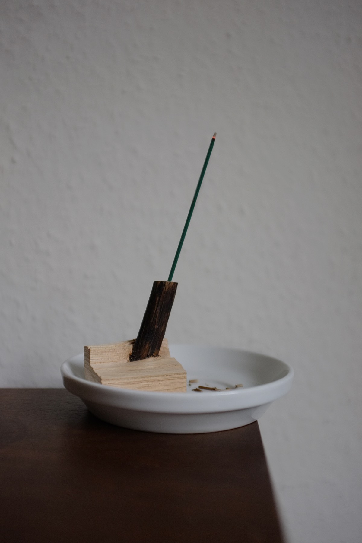
Incense holder. Cutting pine boards for another project, one happened to split like this. All that was left to do was to drill a hole in the protruding branch.
Tasty Coffee 100
hardware

A coffee filter holder compatible with the Roericht TC100 system. Now at the 3D-printed prototype stage. Exhibited in September at the launch of the Das Programm Contemporary Design Reference Archive during the London Design Festival. Stay tuned for production in ceramic.
microsite
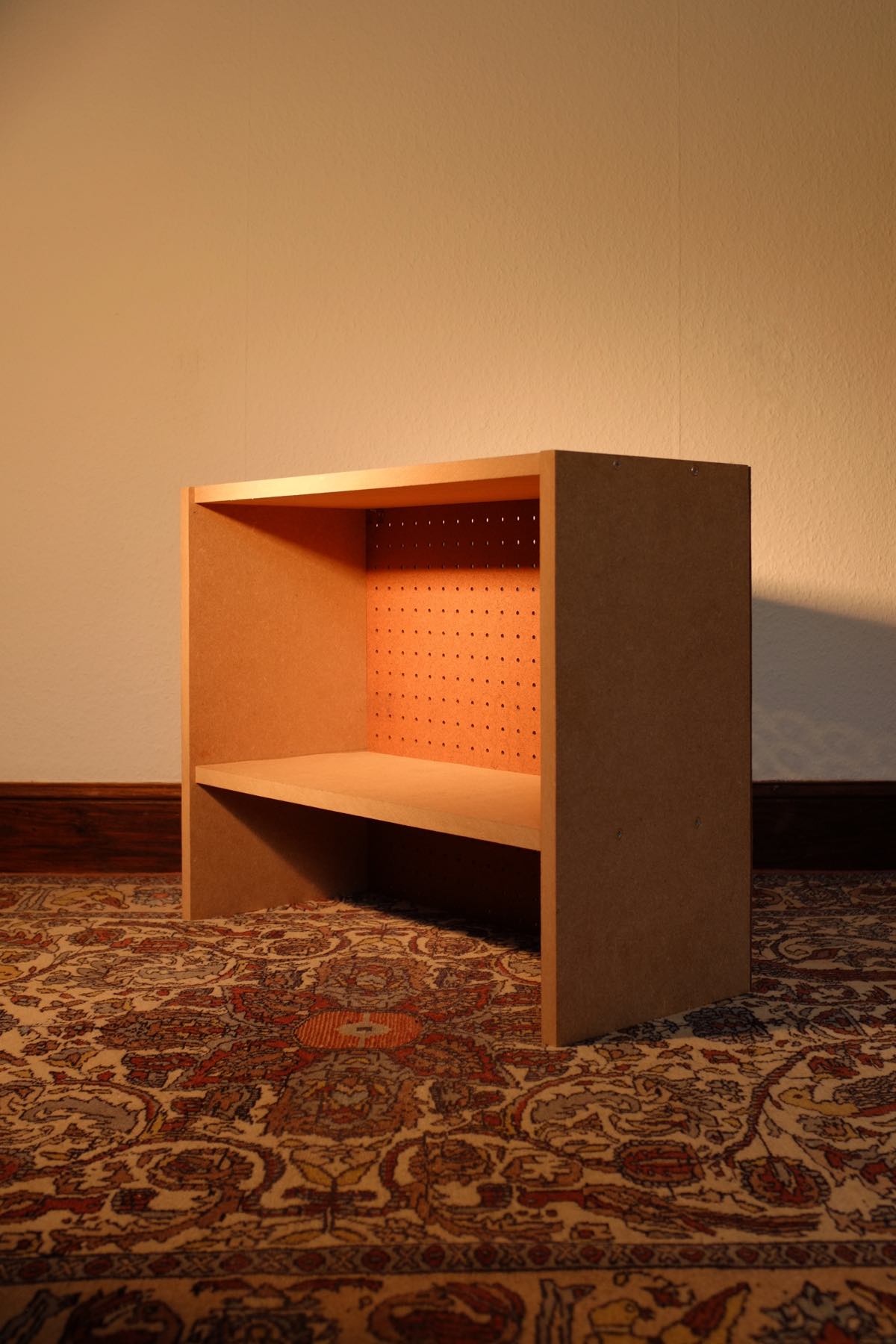
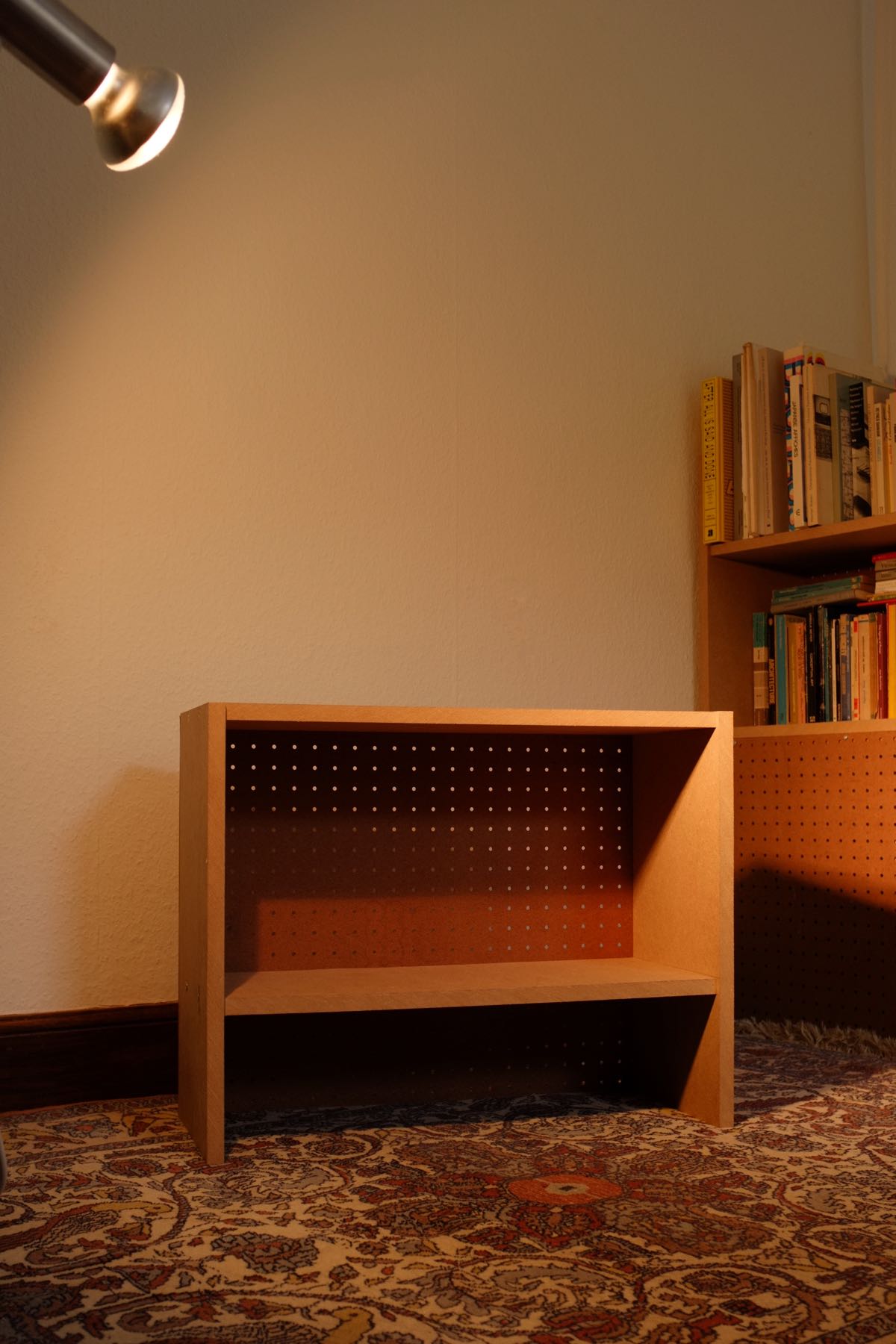
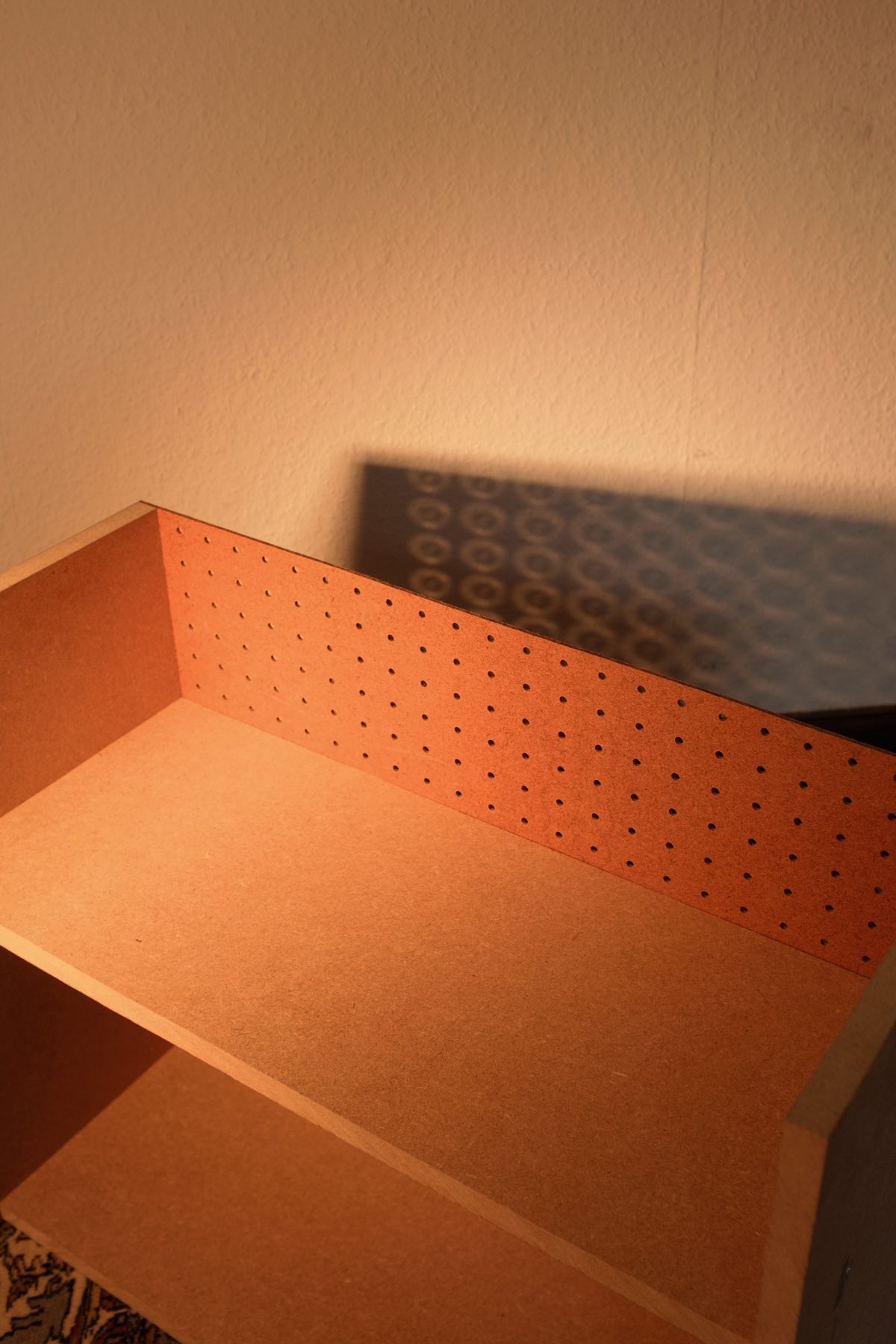
Particle storage
hardware
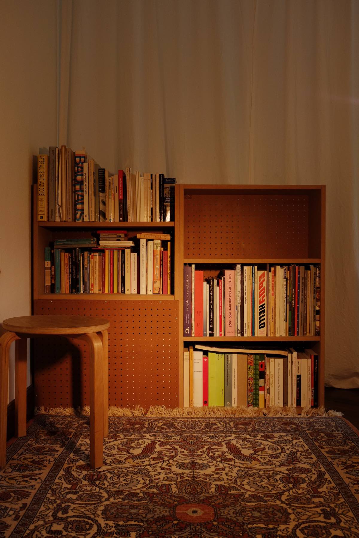
Actually existing storage: getting maximum ugly-but-usable shelf space out of four MDF panels and two chipboard sheets found in the street. This resulted in four identical units. How do we show love to material that can’t love us back? Does a bookshelf need to be made of a water-resistant material, or should you just keep the water away? “We build shelves with the MDF we have, not the solid wood we wish we had.”


Entry bench
hardware
Bench for the entryway of a home to put your shoes under and to sit on when you put them on or take them off. Unbuilt commission.
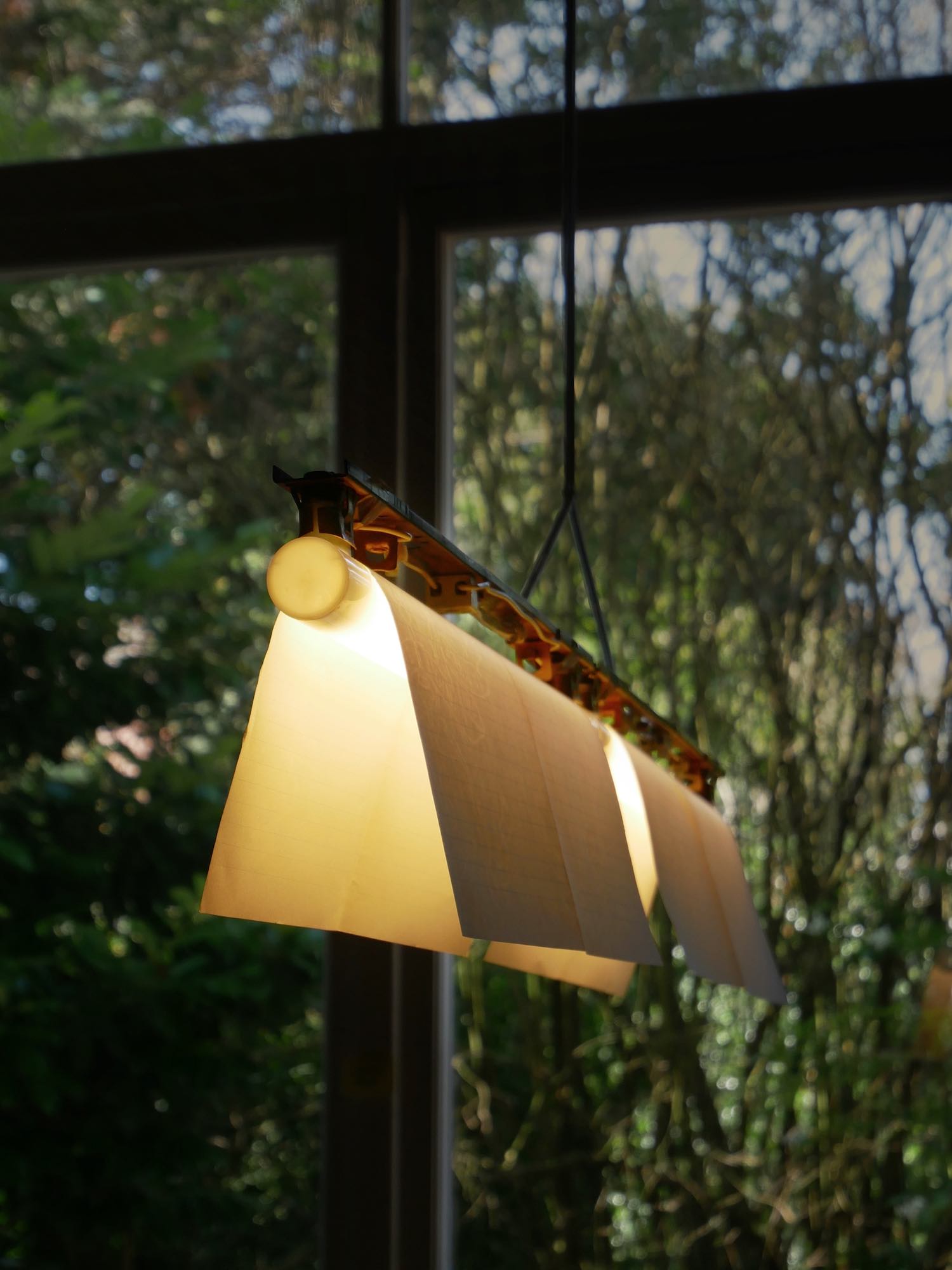
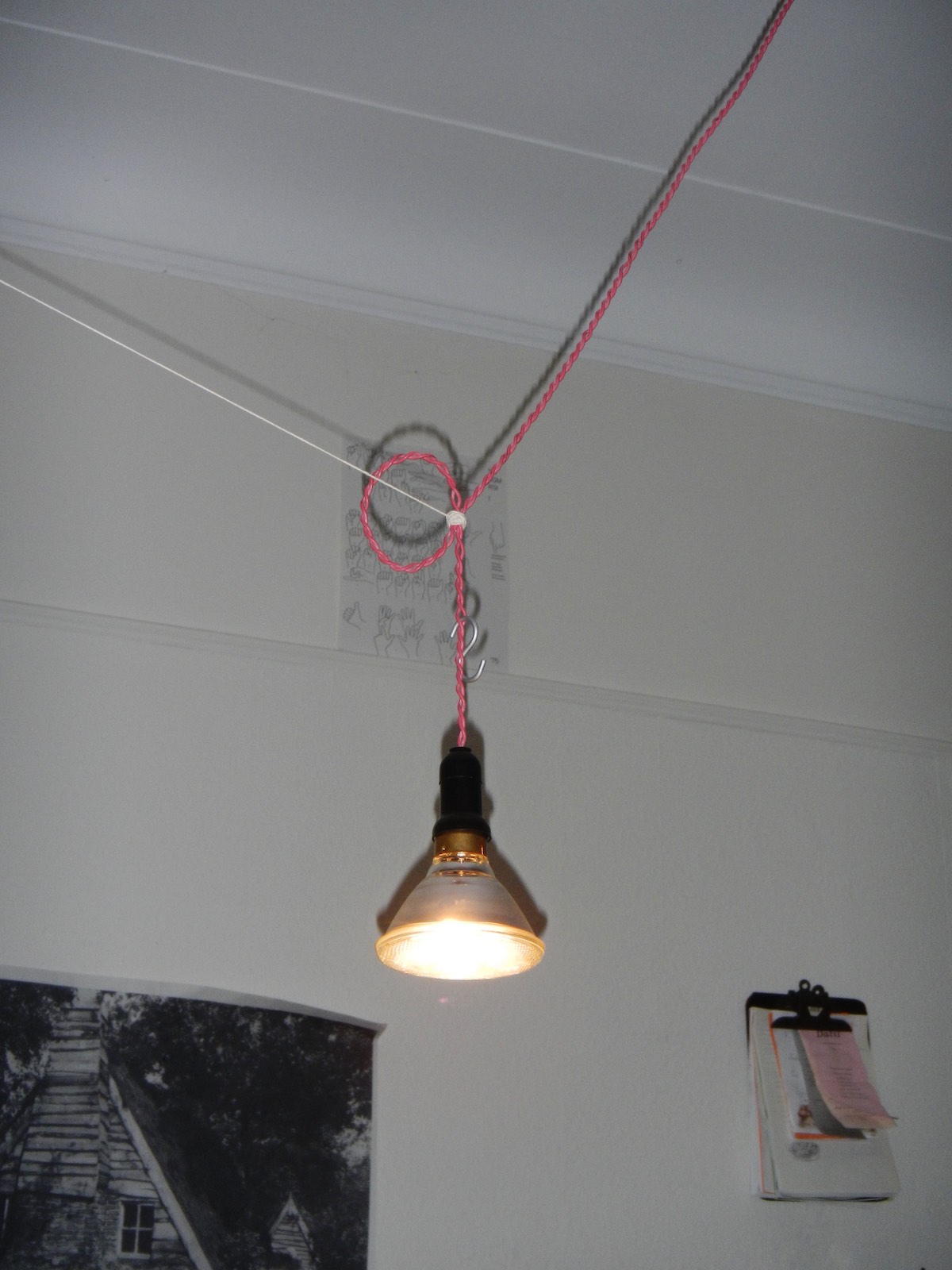
Tube lamp
hardware
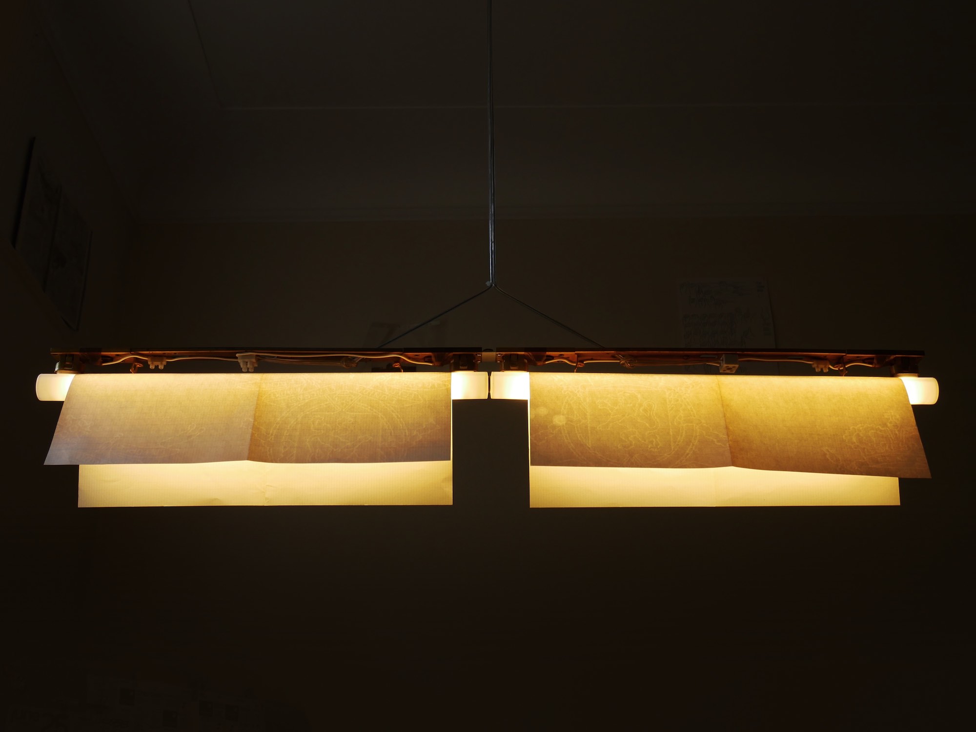
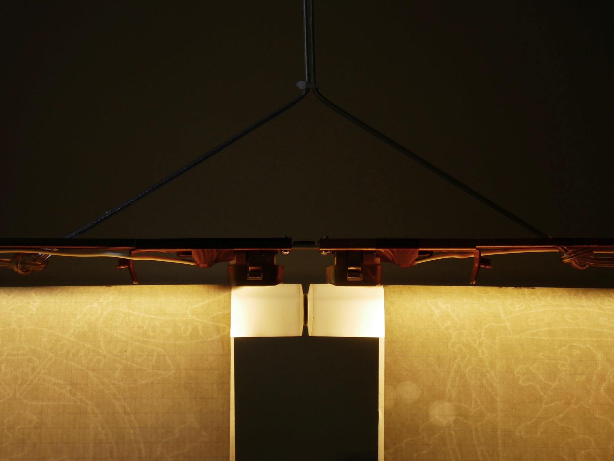
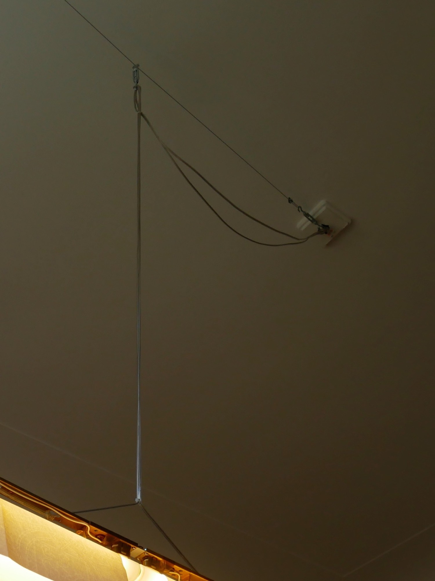
Dining room pendant for fluorescent-style tubes hung from a single point. We started by removing the plastic housings from the two salvaged fixtures to reveal the rich brass-plated steel frame inside. A drilled aluminum plate attaches the two pieces end-to-end. Electrical contacts are covered with TF.50 aerospace insulation tape.
The challenge of correctly aligning a metre-long fixture that hangs only from its centre was addressed by adding a turnbuckle for angle adjustment at the point where the cable hangs from the ceiling. The two A3 pages were modified to create shades simply by cutting small notches where the edges sit against the s14s connectors.
With Nathan Raccah.
Deck
architectural
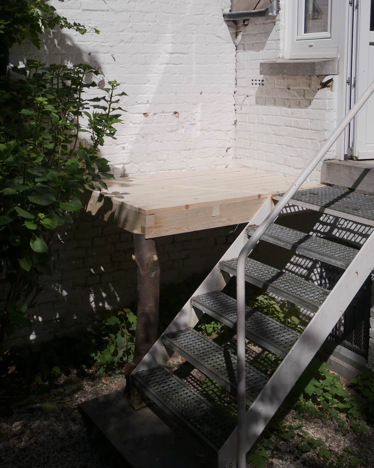
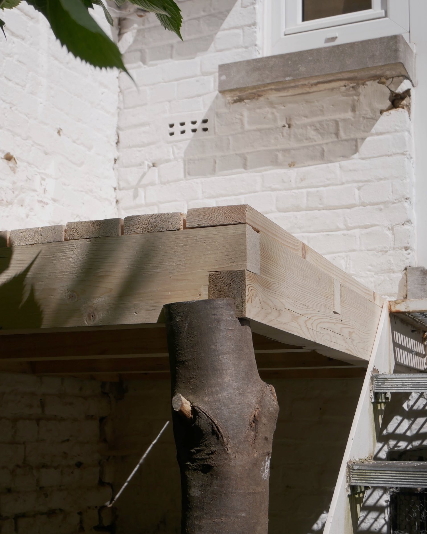
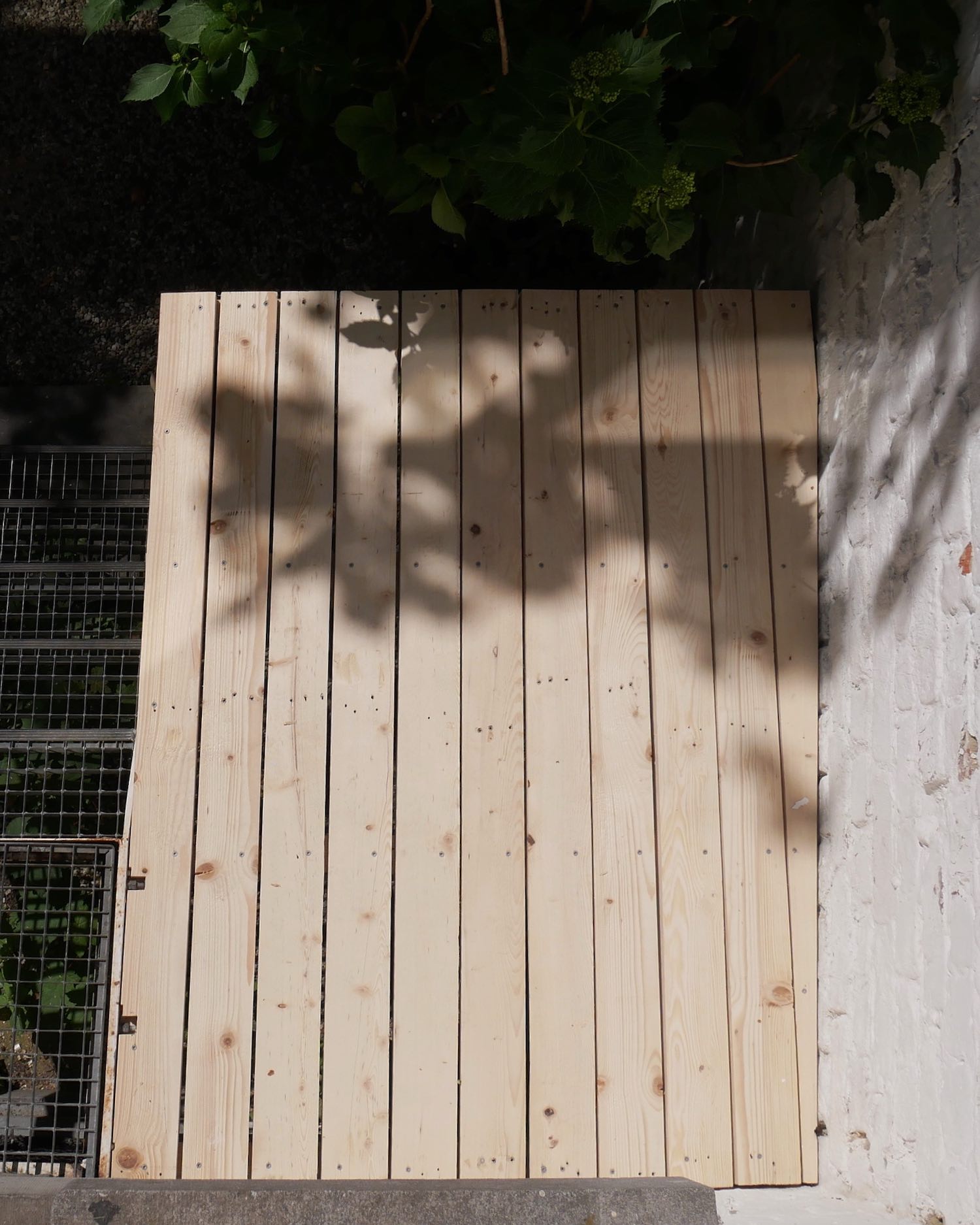
We wanted a deck to catch some midday sunlight in our shady back garden that will hold on until the end of our lease in a year and a half. In an act of faith in the city’s material generosity we rode our bikes around the neighbourhood until we found a large quantity of clean pine in a dumpster and a freshly cut log of unidentified hardwood.
Fifty euros of hardware and drill bits, a willingness to pull nails, an intensive four-hour electric planer rental, and a flexible timeline’s luxuries of experimentation and reflection resulted in a simple wooden platform, somewhere between rustic and refined, working in conjunction with the existing maritime modernist metal stair.
Designed and built with Nathan Raccah.
First build on a budget: dumpster pine and 50€ of rustproof screws (see comment)
The deck was made to enjoy the sun in our otherwise dark below-grade courtyard. First build, informed from this very sub. Dynaplus rust resistant screws for the boards and fischer turbo screws for the ledgers. All cuts made with our newly acquired japanese saw, all joinery, no joist holder. Wood treatment to be determined What would you use this deck for ? We actually REMOVED the railing to access the deck easily and be able to sit on it's side - no children nor elder in the house. It is only suppose to last for the end duration of our lease, a year and a half. Landlords in the sub, are we keeping this in place ?
Hot tub stand? Lol, j/k should be fine for a person or two
May last six months to a year before the Wood starts rotting and that cut off tree starts to wilt and shrink causing that corner to drop a several CM
For a year and a half I wouldn’t give a fuck. Solid as.
Looks good to me nice job life gives you lemons just make lemonade 👍👍👍👍
That’s f’n cool! Curious how the use of joinery versus Simpson mounts compares.
Yeah this would never pass code in the US but it looks structuraly fine for what you are doing.
The Log is a termite attraction. Especially if the base of the log is on or in the ground.
As a landlord, this is a nightmare. In the USA the proropety owner is responsible for the safety of those on thier property. If anyone falls on the stairs or off the deck due to no railing they would sue you and the proropety owner.
The American mind cannot comprehend
Haha what about ?
This is just a very different type of construction than the typical American deck. Looks like great craftsmanship to me, but it’s like reading a poem in a foreign language.
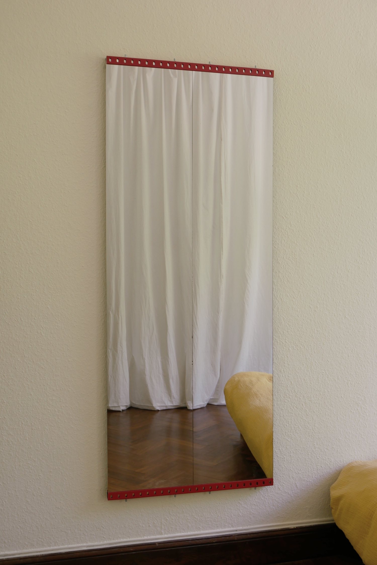
Metal machine mirror
hardware
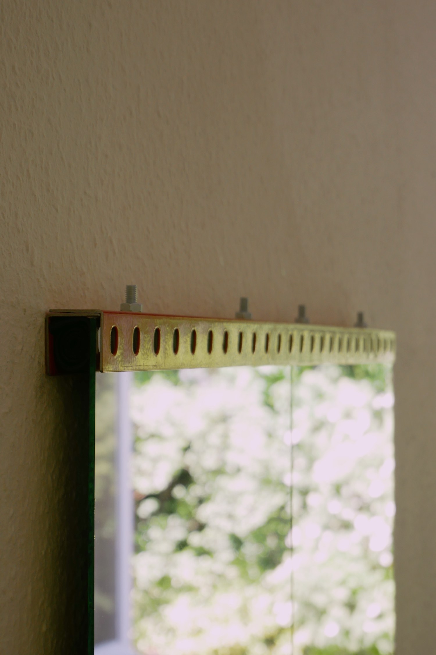
Mounting frame for salvaged mirror panels made of leftover metal shelf hardware with prominent bolts. Rolled inner tubes keep reflections aligned and squash vibrations.

Lemon bottle collection
research, digital
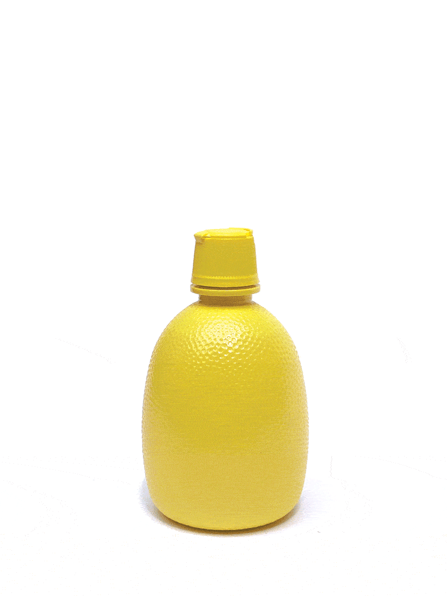
Anywhere I travel, I check supermarkets for skeuomorphic lemon juice bottles. I’m impressed by the variety and strangeness of this typology — some bottles are appetizing balances between realism and functionality, while others appear to be shaped by someone who has never seen a lemon in their life. See below to view all bottles collected so far and filter according to various criteria:
a juicy typology
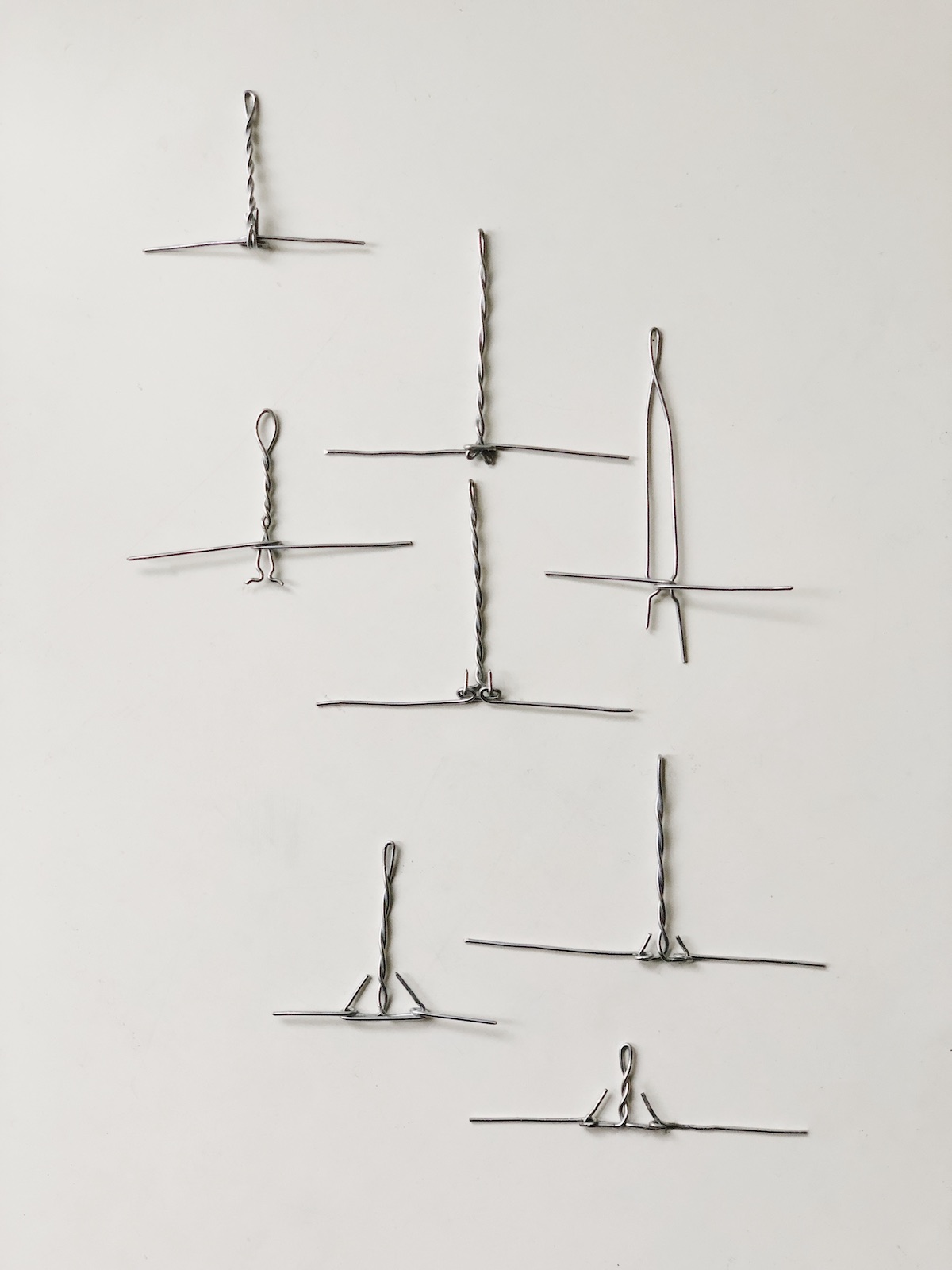
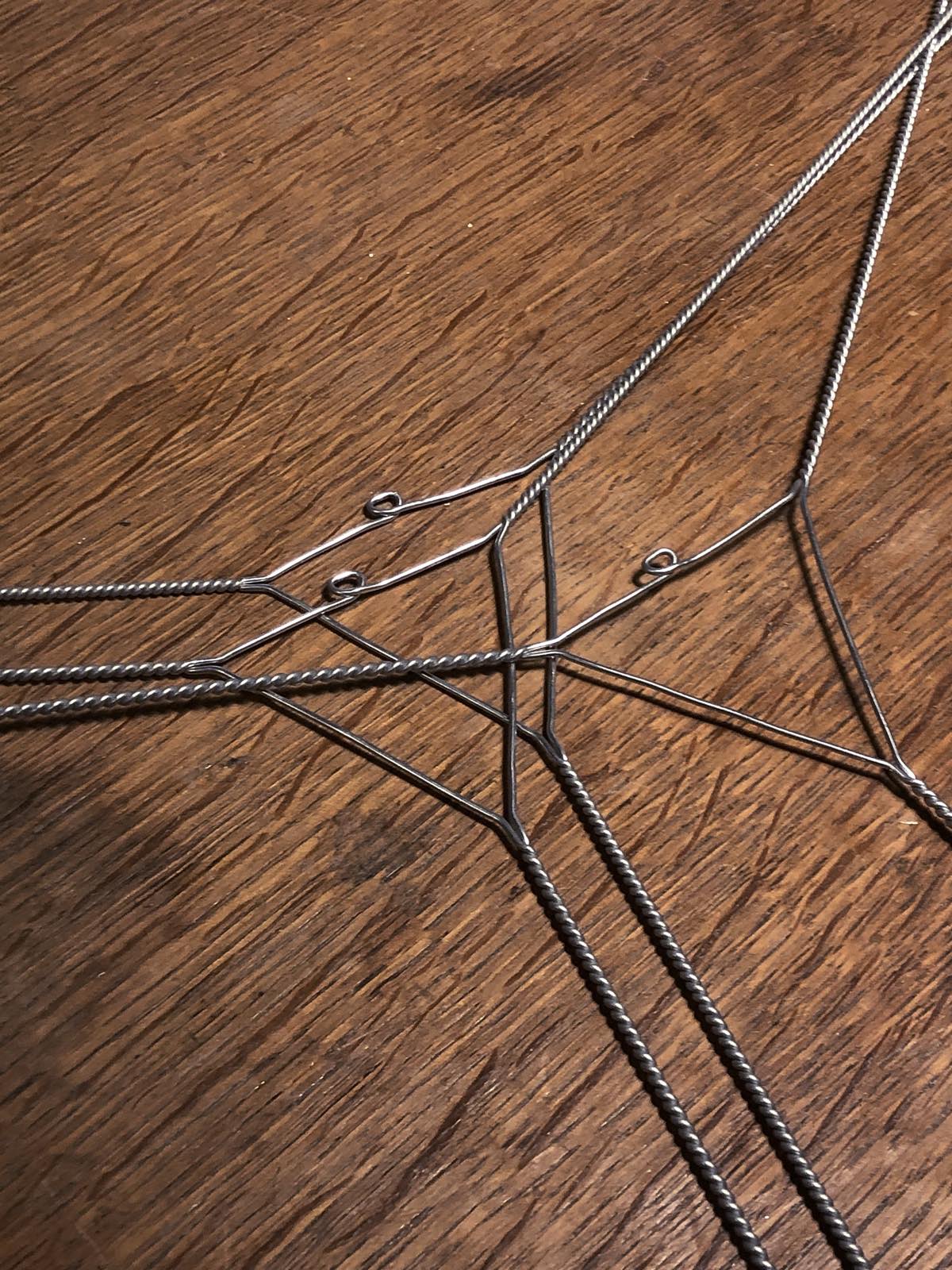
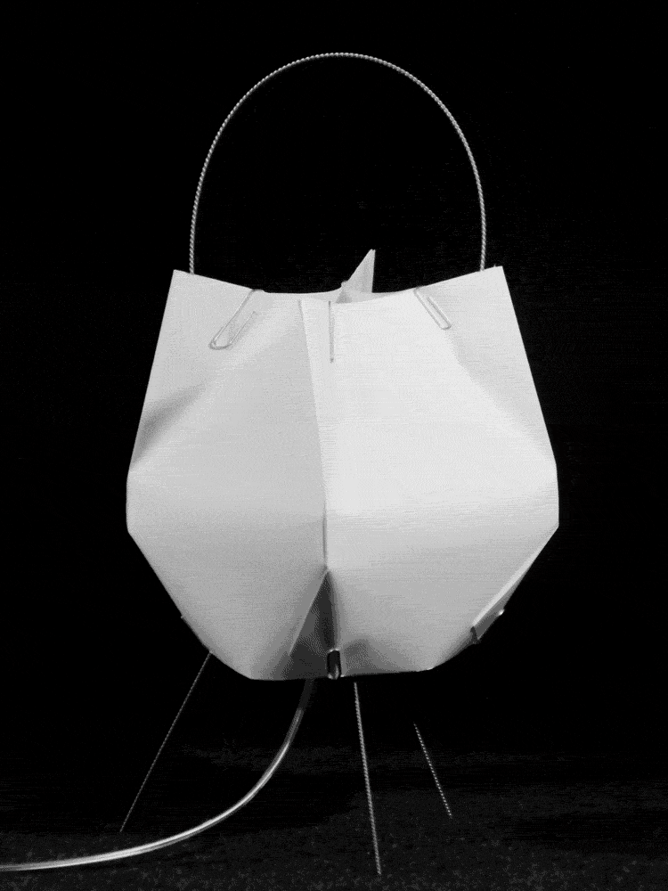
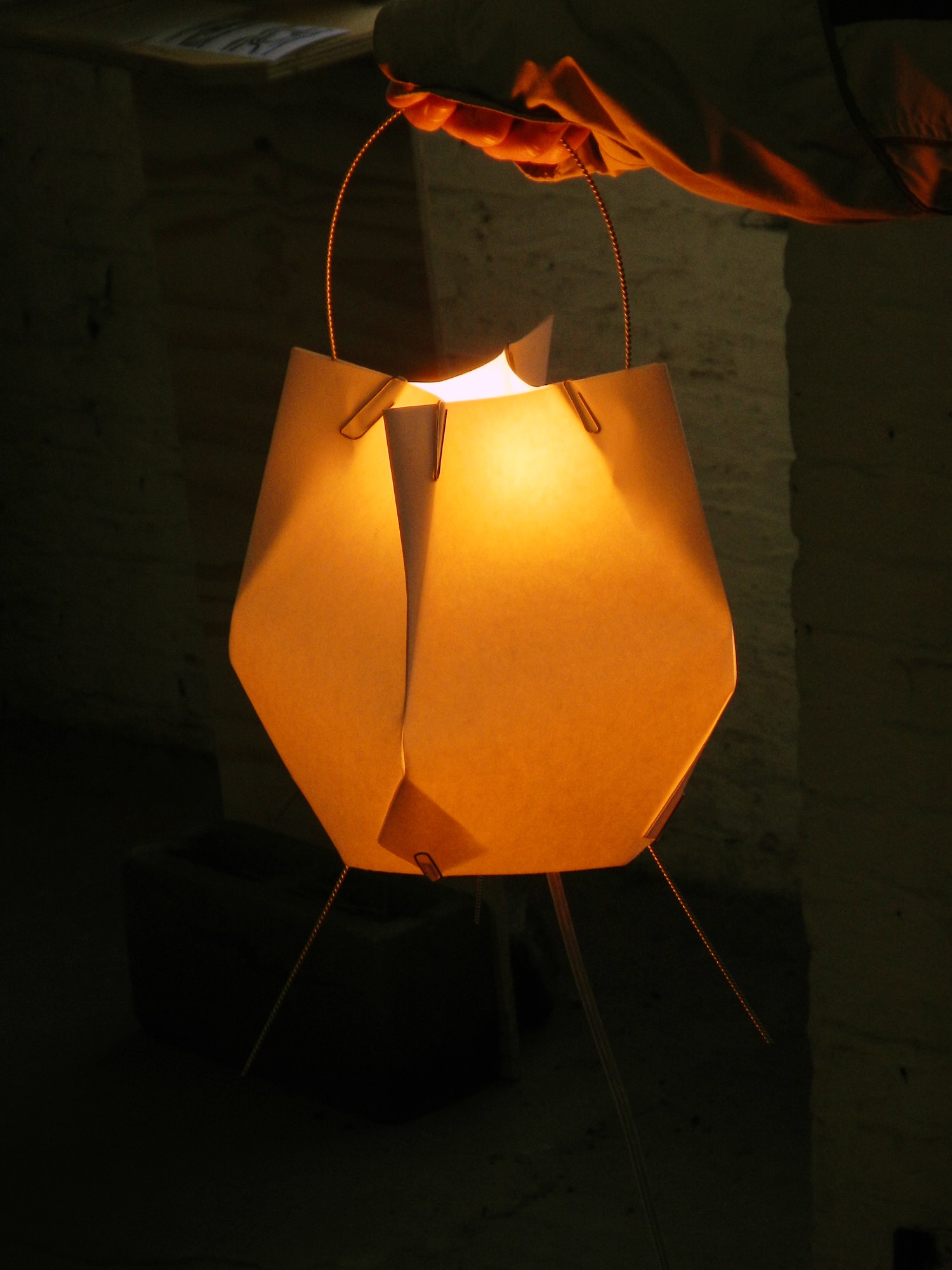
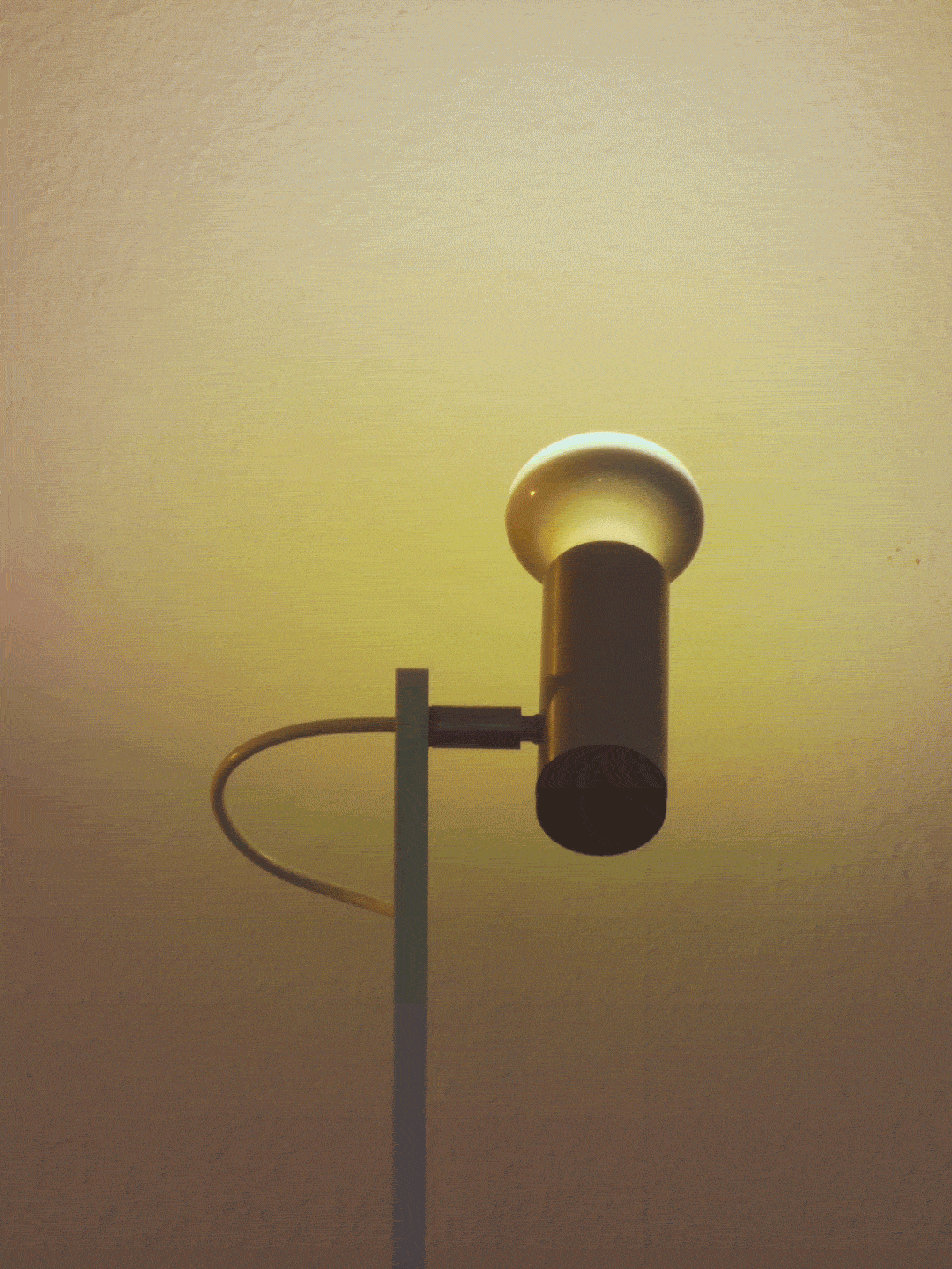
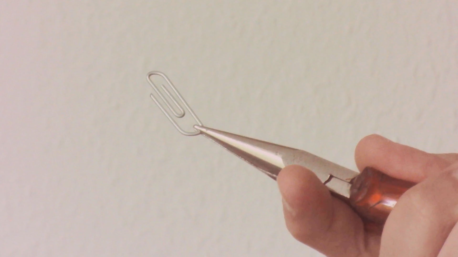
Paperclip JIS lamp
hardware

New, improved paper lamp produced in a series of ten. Stable three-legged twisted wire frame with a better handle, and a double-layered glue-free washi paper shade. Light filters through Japanese acrylic gouache applied by brush directly to LED diffusers on the bulb’s circuit board. Y2K clear cord with Italian hardware. Put it on a table or hang it. Development of Paperclip A5.
order assembly instructionsThe next step is to make the lamp frame easy for the owner to put together, allowing me to flat-pack the lamp for postage. This necessitates development of a wire snap connection to attach the handle to the tripod base, replacing the current fixed connection (below, top-left) between tripod and handle.
Clipless lamp
hardware

The dark, brooding sibling to Paperclip. Screwed-together polypropylene sheets replace clipped washi paper.
order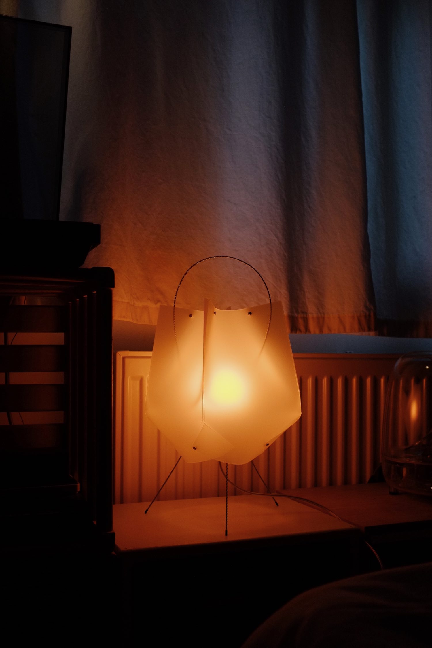
Lamp brochure
graphic


A concise explanation of my lamps and an excuse to use bold condensed American Typewriter like on a German paperback.
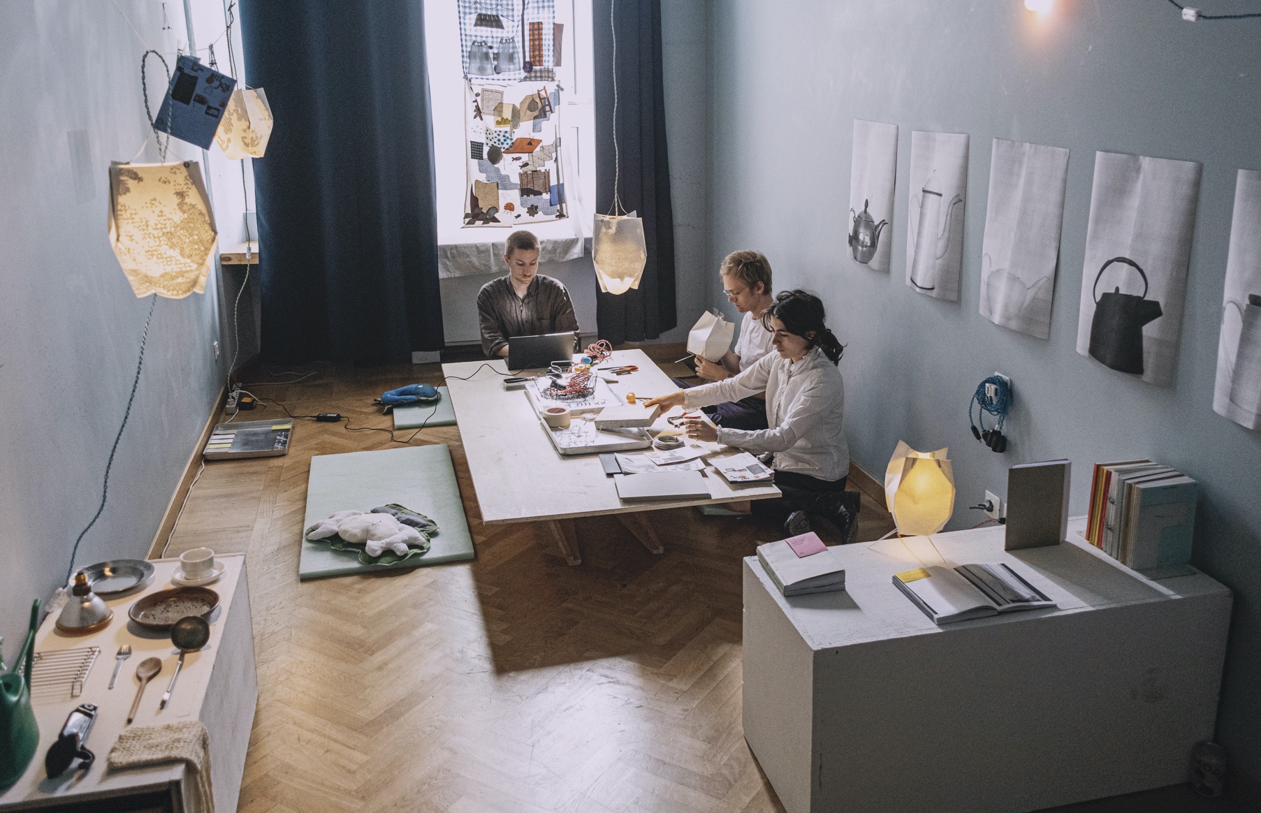
Front of house
event

The first exhibition by ongoing group project Edith in our own house — a test of how we could adapt an underused room into an exhibition space as simply as possible. Organized in collaboration with, and featuring work by, Louise Dousset, Perle Venzal, Tchoutchou Tophoven, Léna Yumie Trullier, Clara Nop, Ward Lauwers with Mathieu Beaucarne, and Nathan Raccah.
“Front of house” ephemera
graphic


Exhibition invitation, designed with Louise Dousset, that we distributed at our favourite bookstores. We tried to make the directions as easy to follow as possible without publicly disclosing our exact address.


At the exhibition, a loose plan of the space with works listed is provided.
Surplus lamp: floor/table
hardware
I’m not a tennis player so it took me a while to figure out what the cast-alloy cross thing was: a tennis racket stretcher, which turned out to be a decent base for a freestanding variant of my Surplus lamp.
Ad-hoc lamp 3: buckets of moonbeams
hardware
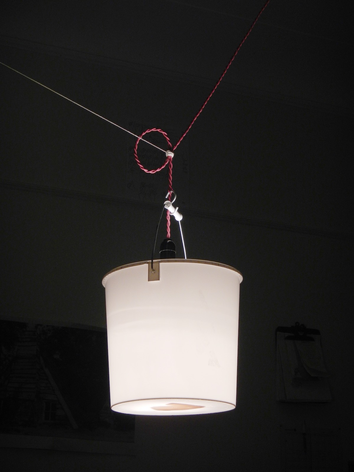
Lamp over a table used for dining and working. Bucket diffuser comes off for task lighting. Sunday afternoon project, please don’t overthink it.
(I didn’t know about Michael Marriott’s bucket lamp at the time, but this one trades a more lampshade-like appearance for easy removal and always knowing you have a bucket handy when you need one.)
2024


“Japanschz keynote” book layout
graphic


Layout and typesetting for A5 publication of essay by Nathan Raccah.
Ian Maclaren architect
graphic
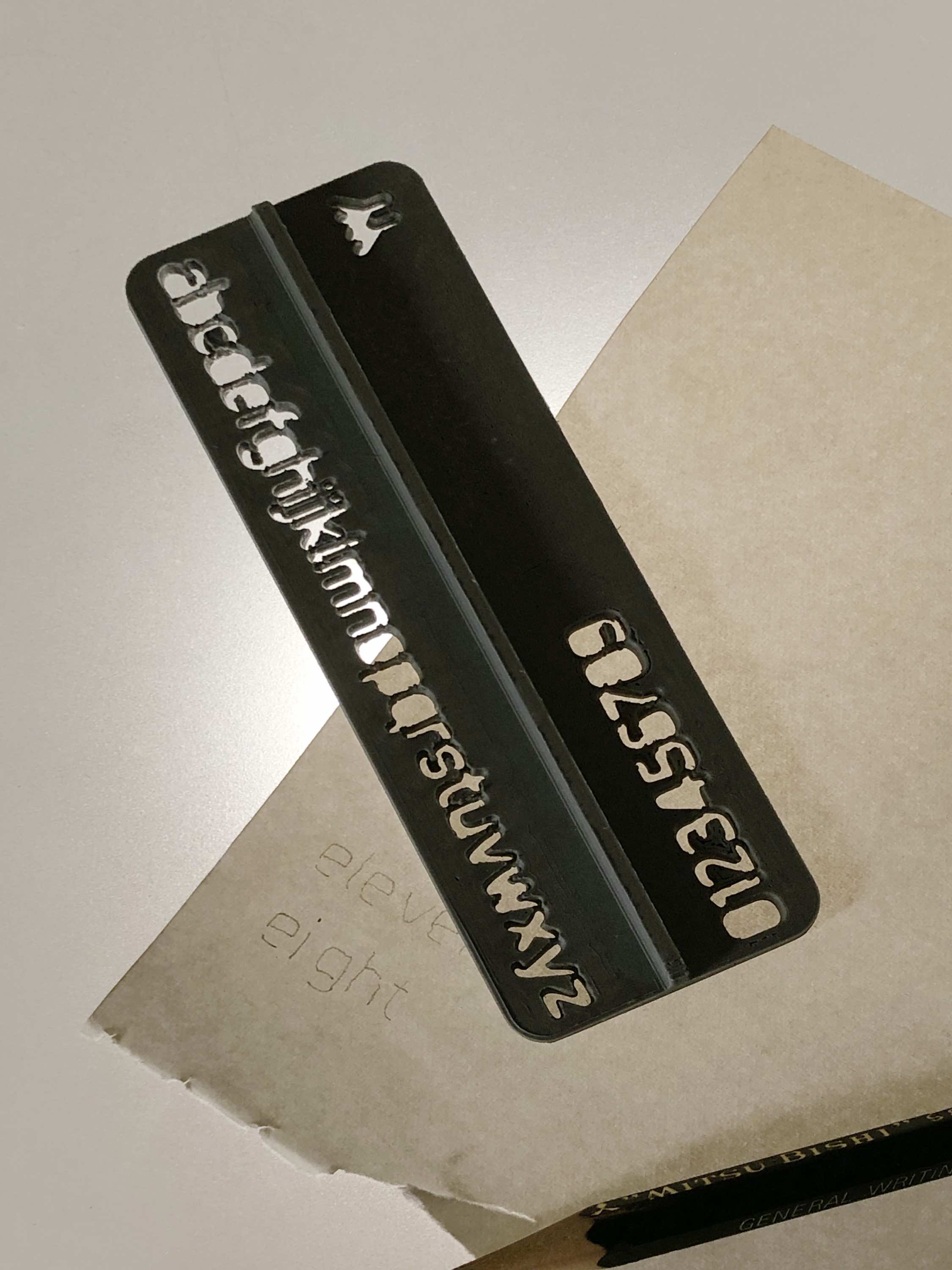
Eleven
typeface

Geometric, monolinear font for physical applications like engraving and 3D printing. First applied to a lettering stencil, also in use online.
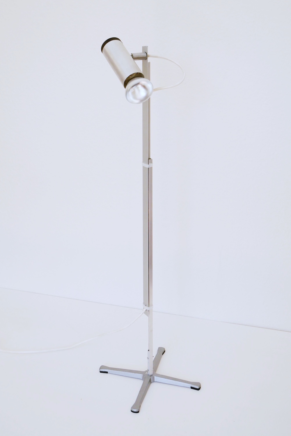
Ad-hoc lamp 2: guiding light
hardware
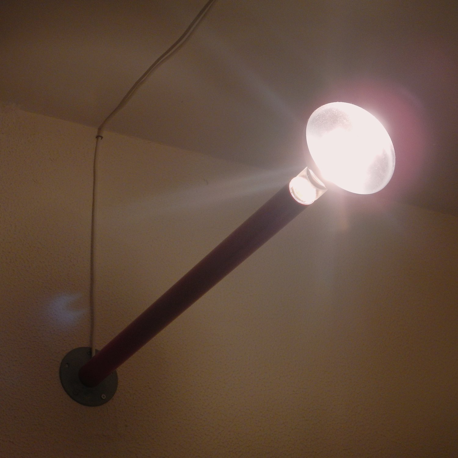
Two-day project — discarded table leg as socket. Based vaguely on gaspipe fixtures in le Corbusier’s apartment in Paris. A powerful halogen bulb makes it the brightest light in the house and a minor auxillary heat source.
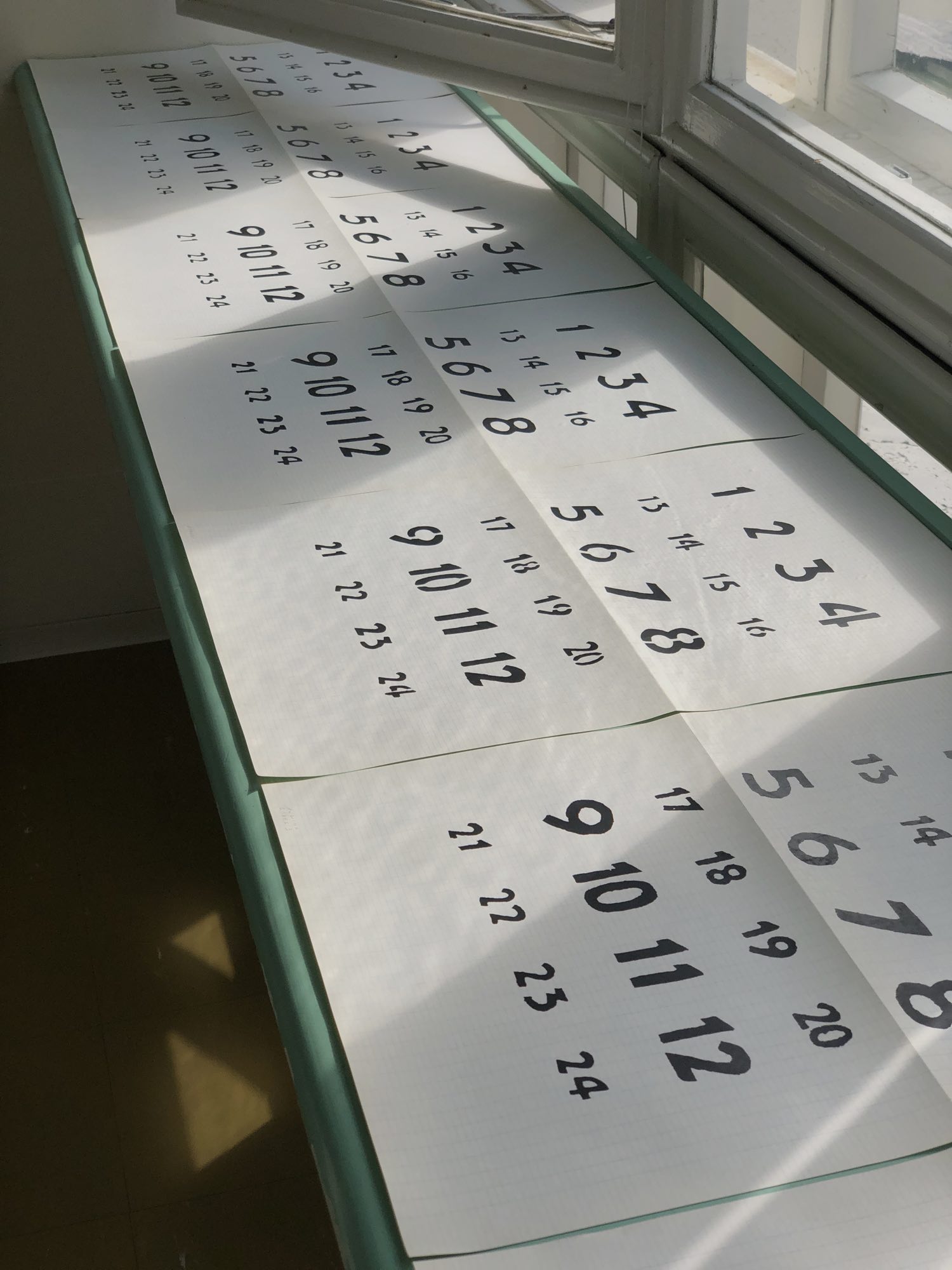
Paimio Sanatorium clock numerals
research
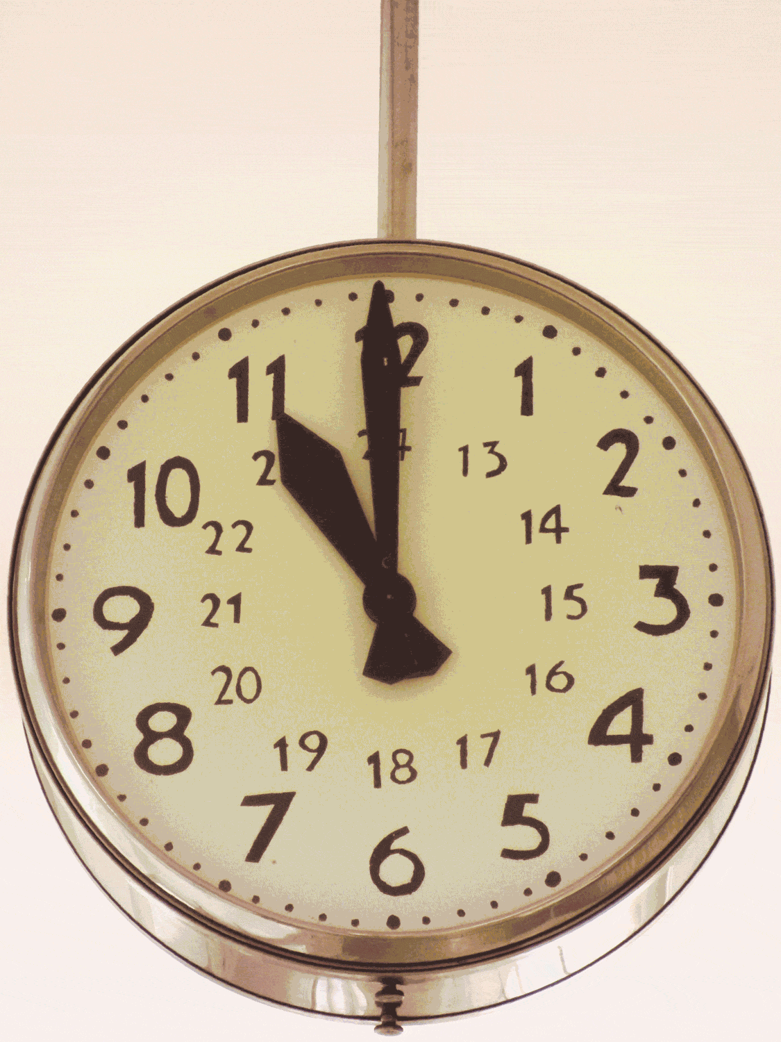
Original, unrestored clocks at the Paimio Sanatorium have flaking paint. Several of the deteriorating clocks were repainted by patients in the sanatorium’s workshop, giving each its own idiosyncratic set of numerals.
For this project from my residency at the Paimio Sanatorium, I photographed every clock of this same type at regular intervals resulting in the animation above and a series of 1:1 scale prints, pictured below on the window desk of a patient room.
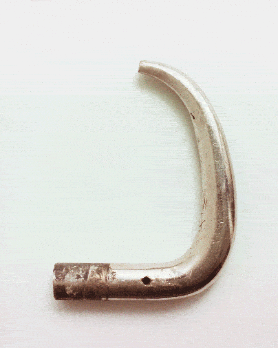
Paimio Sanatorium hardware inventory
research
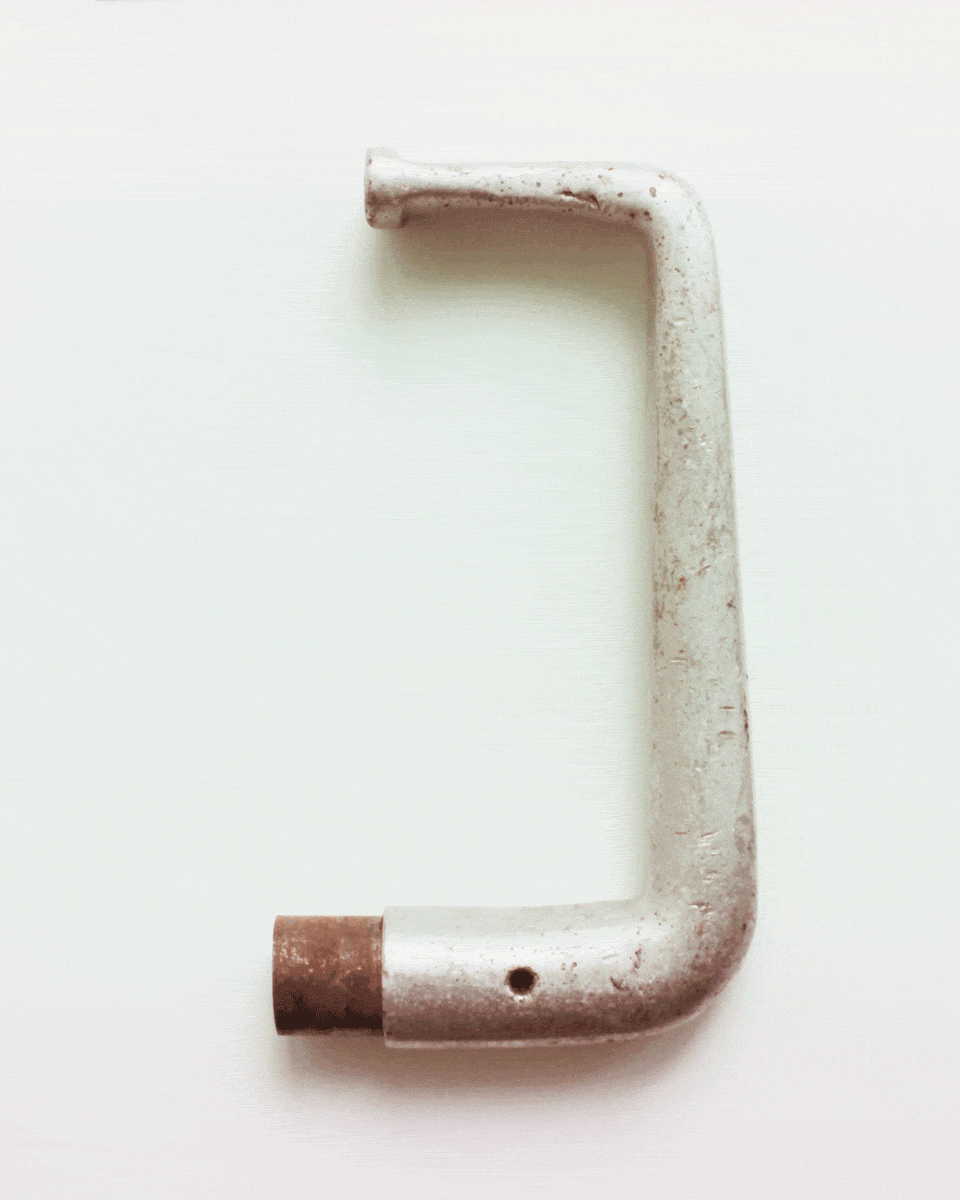
Among the famously thoughtful details of Alvar and Aino Aalto‘s sanatorium are the closed-loop snag-proof door handles.
These are the only fixtures in this building attributed to the Aalto studio, other hardware being off-the-shelf. I conducted a survey of hardware I believed to be from initial construction or early renovations by first walking through the building referring to floor plans, then by consulting the storeroom of spare parts.
Two versions of the door handle designed by the Aalto studio specifically for the building exist: spares from the storeroom in aluminum, closely matching drawings held by the Aalto Museum, and a slimmer variant in heavy plated metal, as found installed in the building on original doors.
Other curiosities include the latches for the large window in the reading room, which exist in three similar versions. Project from my residency at the Paimio Sanatorium.
hardware inventory (pdf)
Surplus lamp: clamp
hardware
An idea that emerged while cleaning up my workspace and materials stash: made of two leftover aluminum profiles, a clamp, jumbo zip ties, a vintage Philips spotlight, and a distinctive halogen bulb. Later updated with a stand.
Paperclip A5 lamp
hardware


A lamp made of two sheets of paper with the watermark of the Belgian royal family, 222 cm of steel wire, a gouache-painted bulb, a bakelite Philips socket, and 4 m of luxurious Swiss-made electrical cable from a decommissioned Luxembourg power plant twisted into a lamp cord.

Developed from an initial collaboration with Louise Dousset, Nathan Raccah, and Ward Lauwers as we worked to replace our house’s landlord-grade lampshades. Louise found the paper, the cable and sockets come courtesy of Ward, and Nathan insisted on the necessity of a handle.
Superseded by Paperclip JIS.
Angeli’s the light
event
Living and working in a room at BASE Milano during fuorisalone 2024 with Louise Dousset, Nathan Raccah, and Perle Venzal. I worked on my Paperclip A5 lamp based on experiments we had done together, and we introduced people to our new collective, Montjoi Institut, through the book we made about our house.
Normandy guesthouse project
architectural
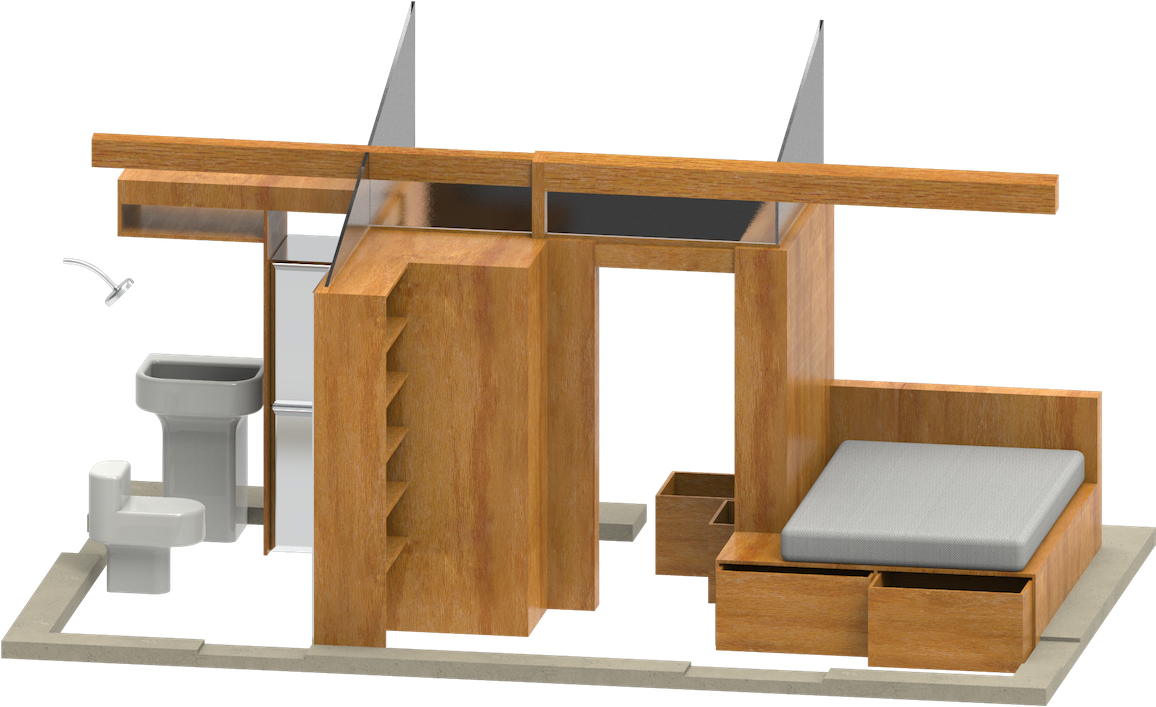
Space-efficient layout for an extension to a small stone house in Normandy, defined by three storage volumes.


2023
Money: commodity or institution
graphic, information


Design for a slideshow, to be delivered in conjunction with a lecture on changes in the function and meaning of money since the renaissance. Judicious composition and rewriting to untangle economic esoterica for a general audience.
artecetera identity & web
graphic
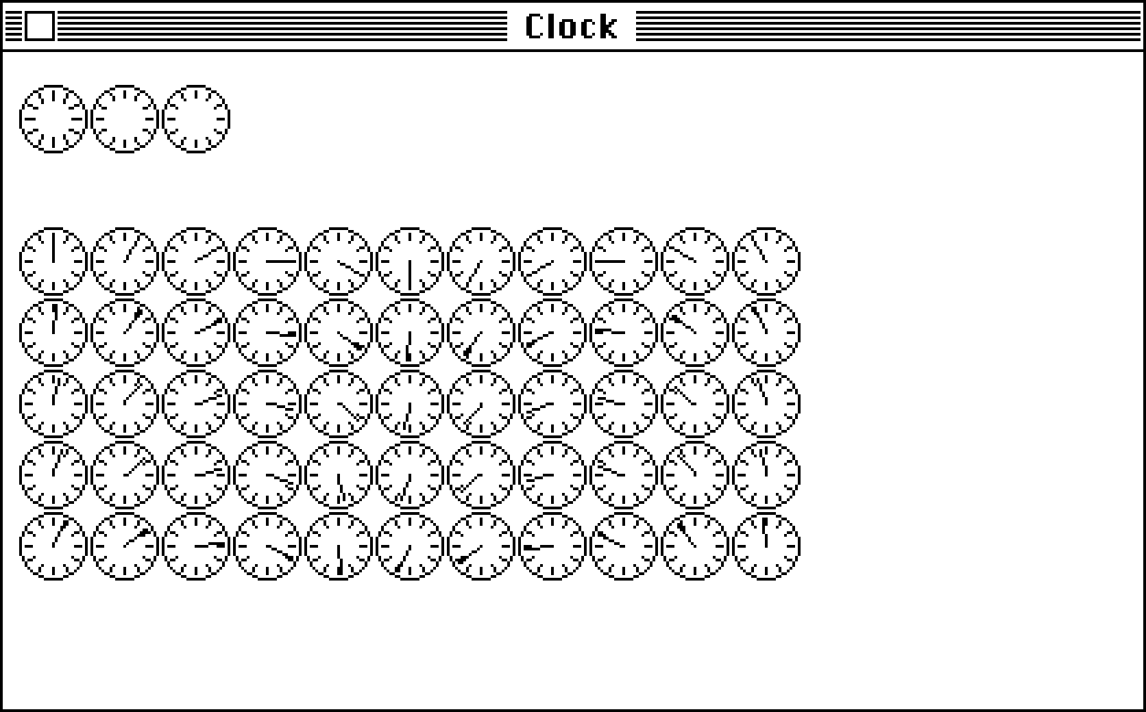
.gif clock
digital
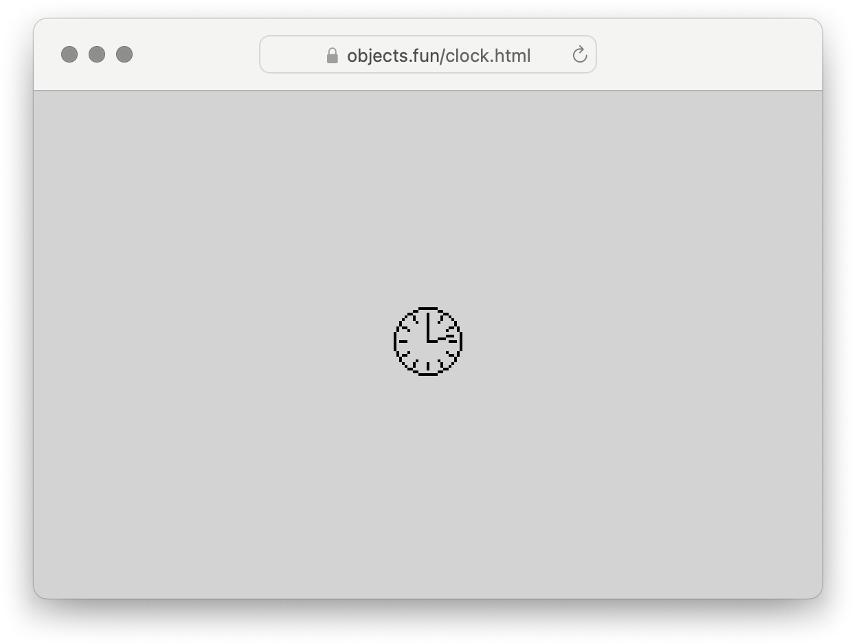
A digital clock using animated gifs as the timing mechanism. Three images are stacked to make the hands of the clock: the seconds gif has a loop time of one minute, the minutes gif a loop of one hour, and the hours gif a loop of 12 hours. The movement starts as soon as the page loads, so if you open it at exactly midnight or noon you will have an accurate clock.
 .gif clock
Meridiem
hardware, installation
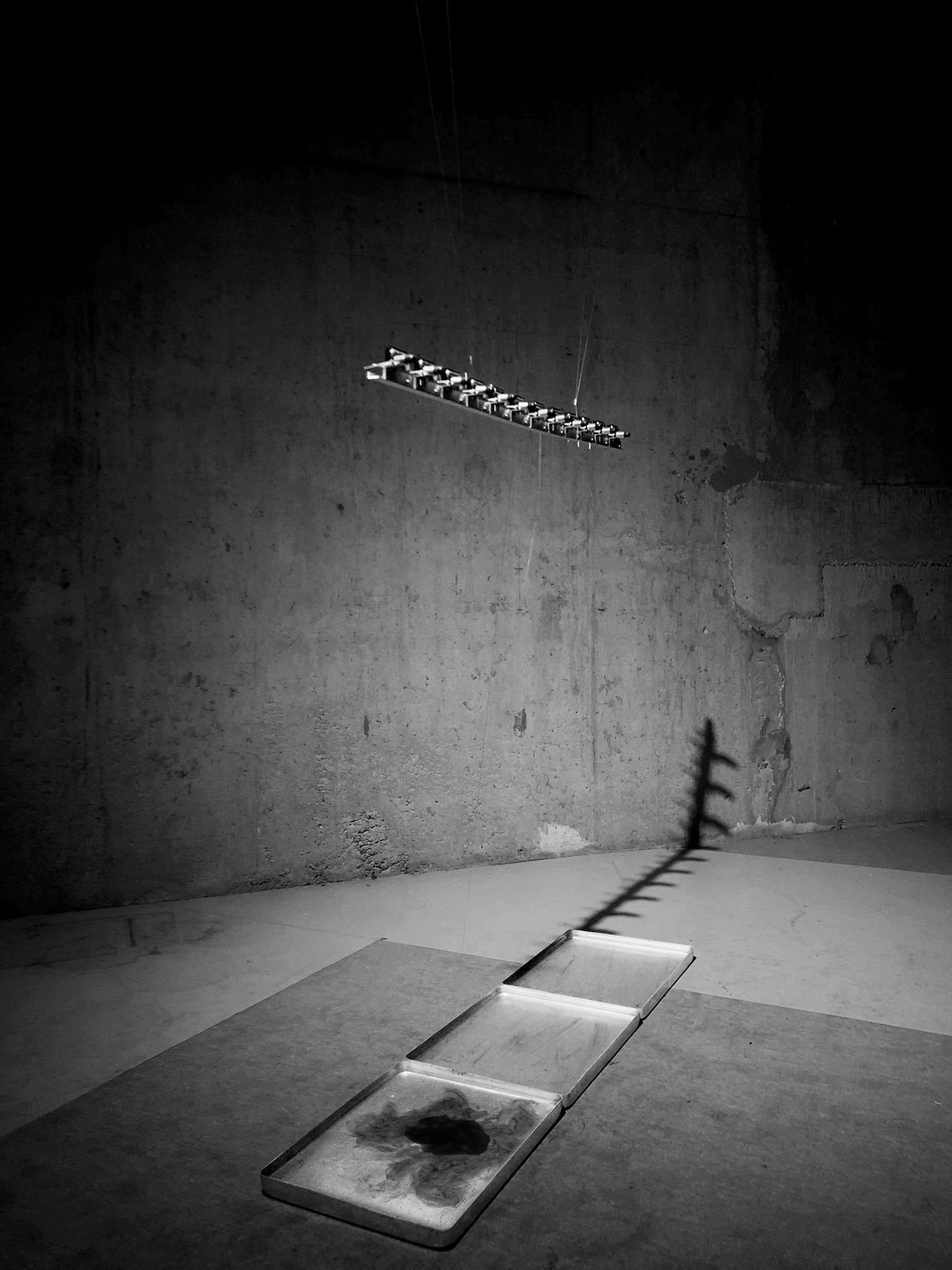
A device to show how time passing can mean two things at once. A series of twelve mechanisms, each made up of a clock which activates an ink dropper once an hour through simple mechanical means. A basin of water, catching the ink and giving it medium to bloom.

There are different, seemingly contradictory ways to observe and experience time passing.
One is that it is cyclical. The basic example of a society adhering to this understanding of time is ancient Egypt among other river-bound cultures, whose understanding of how to live with the seasonal flux of the Nile is associated with the civilization’s longevity.
Any cyclical system is in the image of the cosmos, and so the clock mechanism demonstrates this circular model of time. It comes by this by way of the sundial, a device necessarily adapted to respond to the movement of the sun. Circularity may be functionally vestigial for a standard analog clock but many of us have adapted our daily understanding of time such that the circular model is more intuitive than what is provided by a digital clock.

Another model of time? (among many many others)
The linear, or progressive: our main current historical understanding of time. Unix time, the number constantly going up since 00:00, January 1, 1970. We do not live in such a culture of cyclical response to nature; we have largely managed to untether ourselves. Time is used as a technology in the service of efficiency. Take the arbitrary (useful?) shift of daylight saving time, or the slow, dishonest, shift-prolonging clocks in Victorian factories. Or even the timezone, which in its standardisation knocks clocks out of synchronization with the sun in the easternmost and westernmost regions.
Our structuring mechanical means of telling time is linear. Even a cyclical mechanism must necessarily respond to this by deteriorating over time. The first rotation of the new wheel is perfectly smooth while the ten thousandth has changed as the materials wear on each other with some amount of friction, minute though it may be.

The drops of ink are the more physically complex part of Meridiem. Variables are controlled to a degree, but not enough to prevent some difference in each drop iteration.
One room where it was installed would naturally heat up through the day as people passed, slightly drying the ink on the end of the dropper, thus changing the ink pressure required for a drop to form, burst, and fall. At the same time, the viscosity of the wet ink in the dropper is changing so the drop behaves differently when it hits the water, itself also warmer than at the beginning of the day.
Not only is the water warmer, it obviously becomes increasingly saturated with ink. The inky water is replaced every morning — and without meaning to, this became a primary point of interest in the project along with other daily “rituals” of adjustment and maintenance.
A cyclical routine to enable a linear phenomenon.
I wanted to reconcile the cyclical and linear ideas of time. Meridiem is a synthesis but not the definitive answer to the outcome of these opposing forces.
further reading
“Meridiem”, taken roughly from ante/post meridiem (AM/PM), is used to mean a twelve-hour interval of time that a clock takes to make a full rotation, regardless of the interval’s relationship to time of day
Time escaping
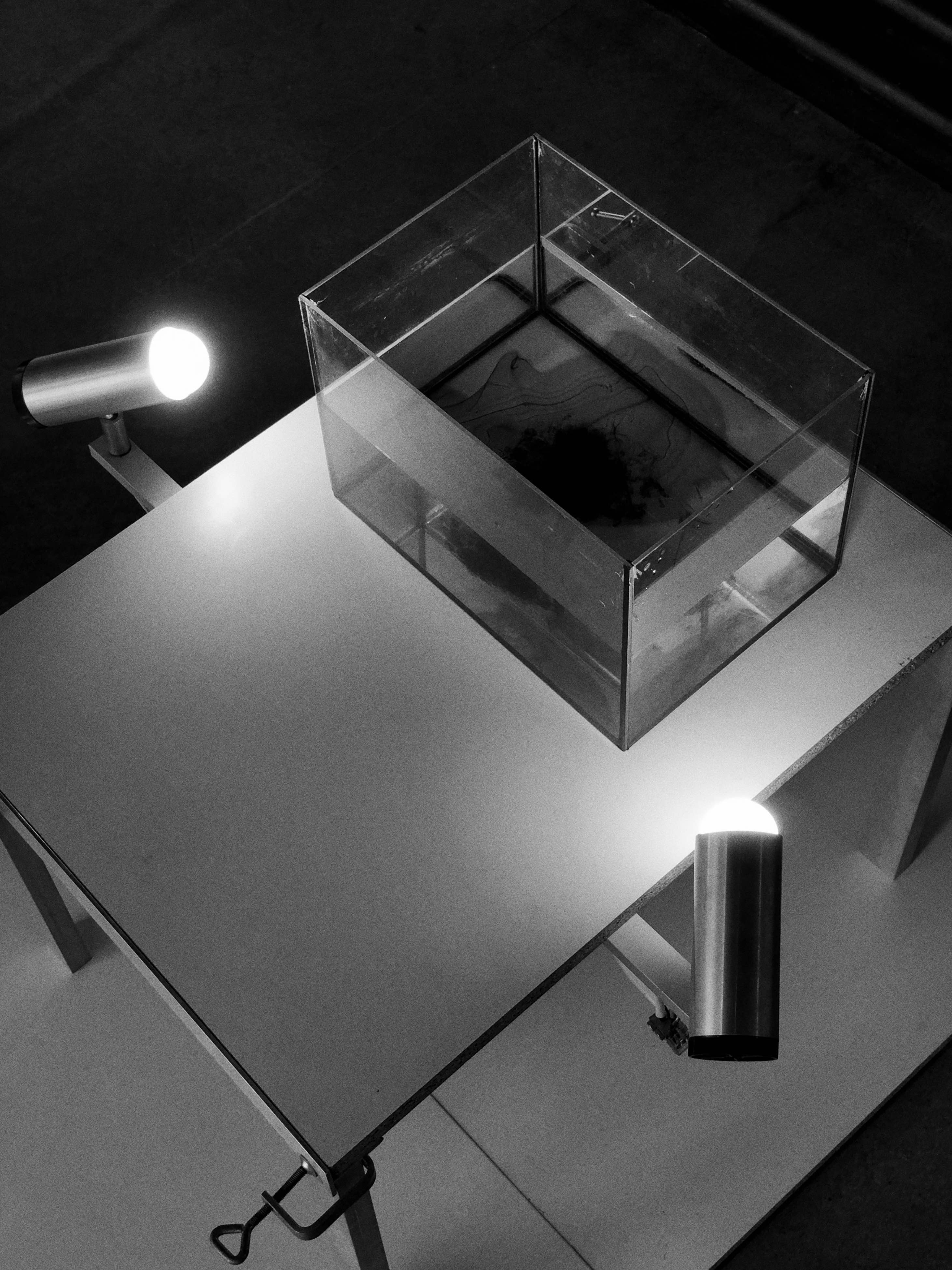
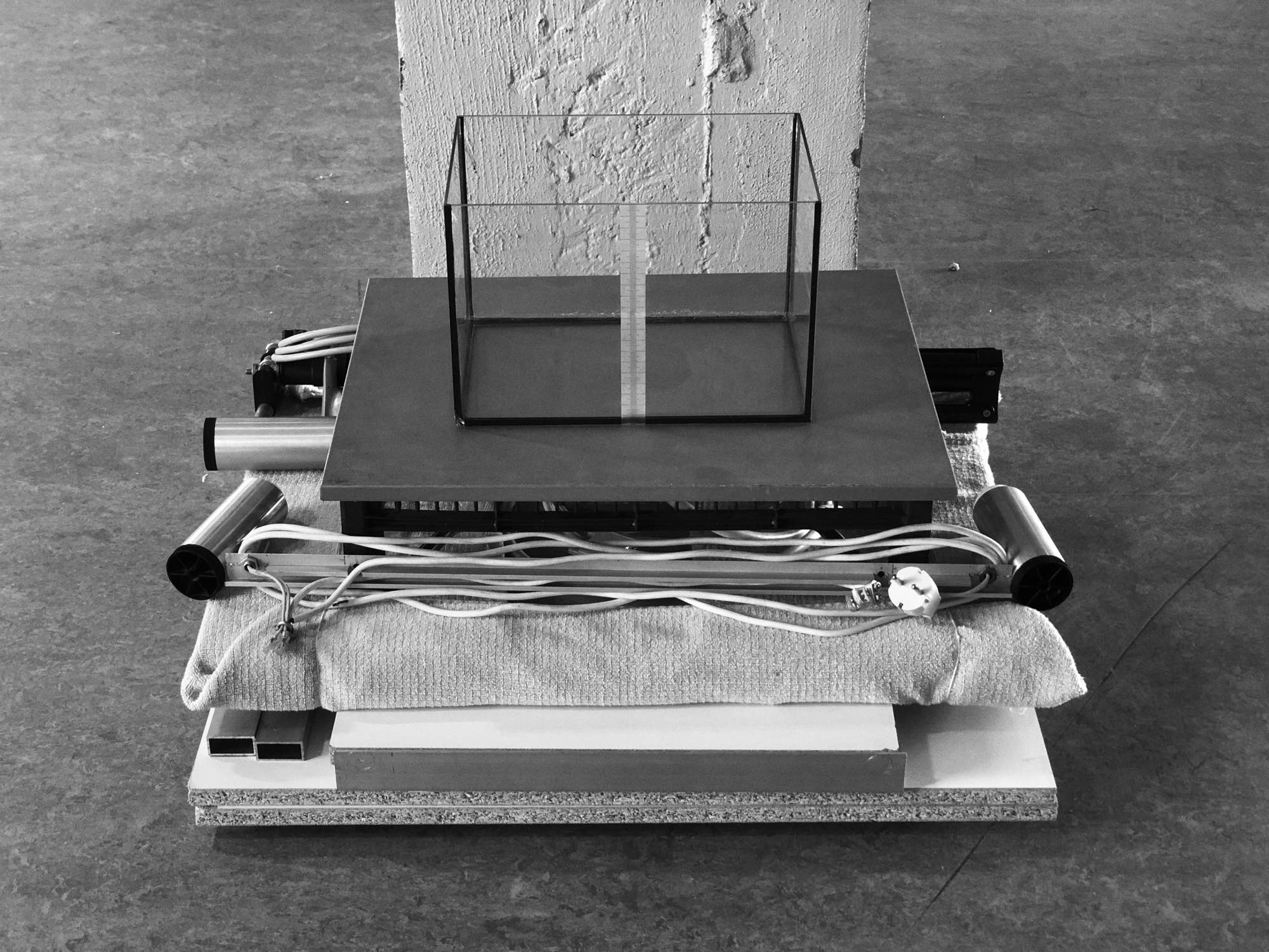
hardware
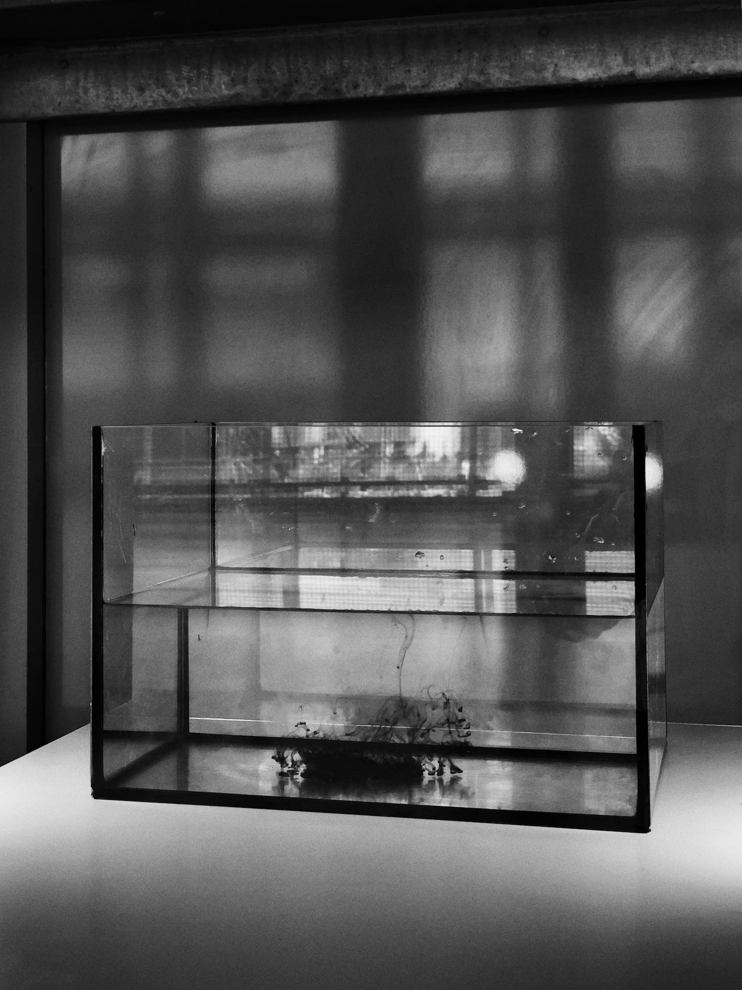
An elevated glass tank with lighting that I used and adapted throughout the semester to do fluid experiments and tests, as I worked up to the Meridiem ink-dropping device.
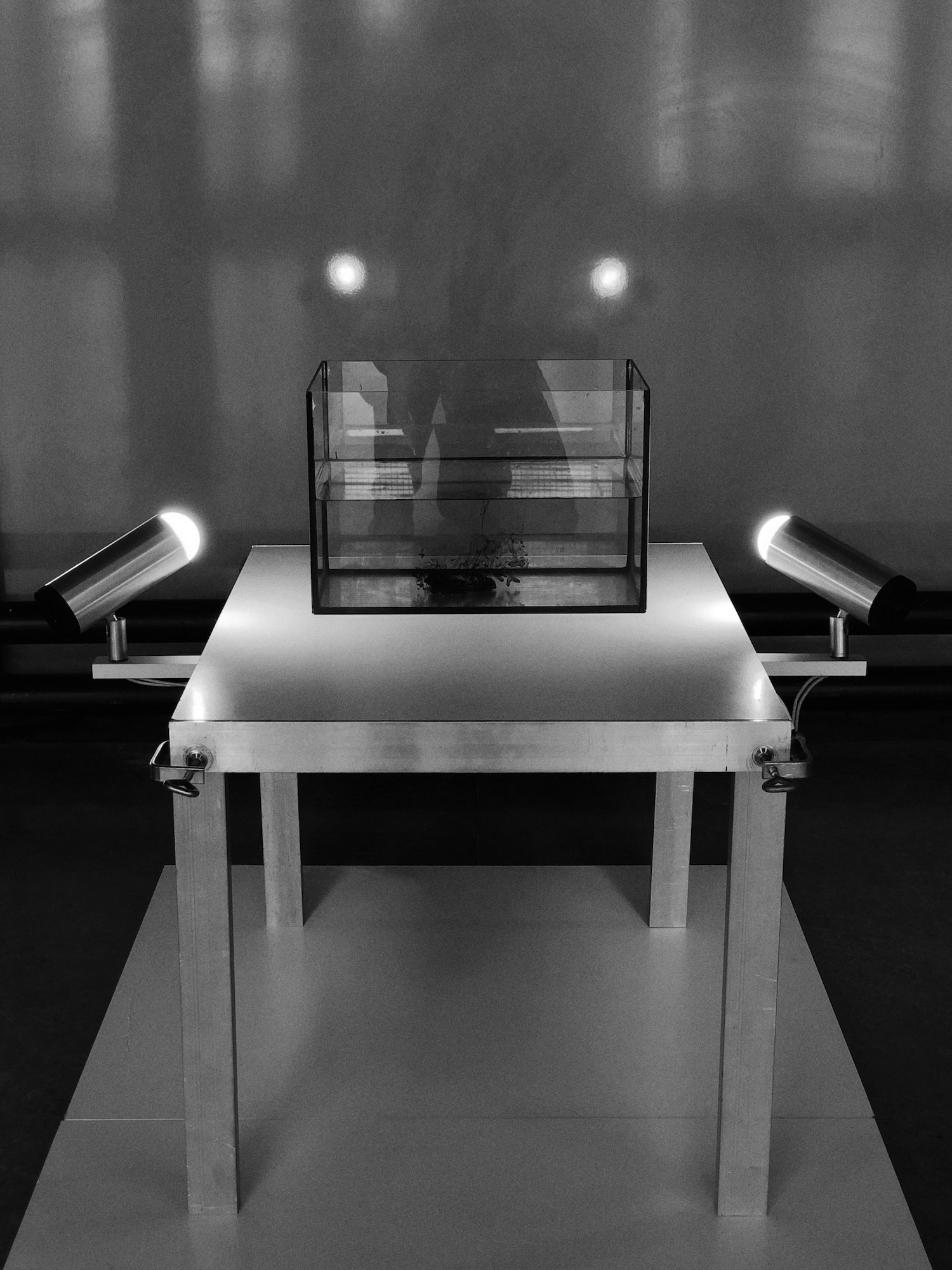
Clamped together so it can be taken apart and reconfigured, small and densely packable so it can be transported. Capturing and compacting time.
further reading:
how why
Graduation displays
installation

I presented Meridiem and Time Escaping four times at the Design Academy — once at the midway point in the semester, then three times at the end to different examination commissions. I took a different approach to each of these both spatially and discursively.
Each installation was in a different place. Working with the same set of panels and lighting each time, I tried to plan as little as possible beforehand and set up entirely based on the space.
I assembled a set of elements: scavenged chipboard shelf panels in two sizes, moulded cardboard padding pieces, a plastic crate or two, a secondhand XL macintosh screen, Philips spotlights, and some tripods and aluminum profiles. Then I’d find or borrow whatever bricks and boxes could be useful but interchangeable.

There was considerable strife about the boundary between the exhibition design and each of the two projects. I always conceived of the three design tasks as a whole. It would have been artificial to arbitrarily use different panel sizes for the Time Escaping table and the exhibition surfaces or to use steel for one rather than a range of aluminum throughout.

Worse still would have been to use the provided exhibition furniture. I was not willing to settle for an ugly, low-quality screen when I had a good one (incidentally, cheaper) that matched the materials of the rest of the setup.
In the first presentation, I sat, kneeled, and stood behind the screen and two tables and addressed the commission so that I was looking at them rather than the display. This was received as being a performance piece. From this point on I would stand looking at the display alongside the commission, which diffused expectations of a performance but diminished the quality of conversation and interaction.
Inside-out clock
hardware
xandermaclaren.info
digital, information
I decided to move away from the increasingly bloated visual site builder I had been using for years and gave myself a few months to figure out html and css with no prior experience.
My main objectives, beyond saving money and learning something, were: minimizing dependencies; improving information density in both visual and bandwidth terms; adhering to standards; thinking about future-proofing and avoiding trends; using the characteristics of different screen sizes with more intentionality; and making use of good tools (BBEdit, mechanical keyboard).
I learned to value the aesthetics and legibility of my code as well as the rendered page. Moving away from social media platforms around the same time reinforced to me how wasteful and overprovisioned almost every online platform has become for most peoples’ needs. It is in platform operators’ interest to mystify the process of publishing work online, but it remains satisfying, cheap, and simple to do it the old-fashioned way.
Atelier Lachaert Dhanis book
graphic
Ad-hoc lamp 1
hardware
Bike carrier
hardware
What’s good (relevant forms…)
research, digital
visit project
What is the relevance of a functional object without function? The twin factors of obsolescence and replacement, and wearing down through usage or neglect, push once-valued things into the dusty shelves and soggy cardboard boxes of material purgatory. A brief window exists to get a grasp of these things as they pass from discreteness to aggregate, and our only option is to take them as they come.
Find a “design piece” you've seen only representations of and you may be surprised by how little it can do for you outside its intended time and place. This project is an argument for a quality that remains independent of something’s original purpose. Anticipation of unselfconscious usage evaporates and leaves behind a mist of directionless, unprogrammed visual and tactile interactions.
This project is an attempt to create rich and rigorously objective replicas of found objects that possess this quality. Available here are digital models, each based on a close reading of an object’s surface. It is my hope that the process heightened my sensitivity to this quality, and that the models can themselves be used as references, when the originals are not available, for what might be formally “good”.
2022
Terra
typeface
download font
Nicholas Jenson’s 15th century roman typeface represents a crucial point on the spectrum between hand-lettered calligraphy and constructed type. Structurally, it is formed by the shape of the pen nib and the movement of the calligrapher’s hand, yet it is idealized to remove abnormalities that would become distracting with repetition.
In drawing letters based on this typeface, I wanted to learn why these letterforms were “correct”, on their own terms. Applying a set of geometric heuristics, the well-resolved nature of something like Helvetica is clear, but I suspected something else was going on with serif lettering that came from a tradition outside modernist uniformity.
The process for creating the letters began with drawing them at a 5 mm x-height with a 1.5 mm nib in black ink. Each letter was drawn many times to better understand its construction and to obtain better results. These pages were photographed, one instance of each character was selected, and the drawings were cleaned up and vectorized. In some cases, a final digital glyph would be composited from a few different drawings.
It became clear through the process that the logic of the roman lowercase came primarily from the hand and the tool rather than a set of geometric rules. Angles on glyphs like the lowercase e were determined by how the pen was held, and serifs felt like a natural way to terminate vertical strokes.
At all times, a balance had to be made between cleanliness and preservation of aspects of the original drawing. The end result is not necessarily resolved — too much like handwriting by the standards of a typographer like Emil Ruder — but crucially, it does preserve marks of its handmade nature.
A lowercase set of letters with limited punctuation was fine as a proof of concept and had a certain conceptual completeness, but the constraints imposed on the user of the typeface unsurprisingly became a problem. A set of numerals was the first step in addressing the functional deficiencies, but an uppercase proved necessary.
These characters were not originally included because the formal development of the roman uppercase had more twists and turns that that of the lowercase. Instead of a progression from pen stroke to cut metal, the origins of capitals in Roman engravings (themselves perhaps based on brushstrokes, according to calligrapher Edward Catich) had to be considered.
A certain short-circuiting, bypassing the rigidity of the chisel, was needed in order to come up with capitals that matched the existing lowercase alphabet formally and methodologically. Important aspects, namely the consistent pen angle, could not be maintained were the Jenson model followed as closely as before. What followed was a process in which the final form was less predetermined.
Now that I better understood certain practical reasons for the shapes of letterforms, I wanted to test the concept of anticipation in creative work — how known is the outcome at the beginning? As drawing the lowercases was a matter of emulation, I expected all along that each lowercase Terra glyph would bear some resemblance to its Jenson counterpart. Now, for each uppercase character, it was necessary to project something that was visually harmonious with the other glyphs and true to its process but still recognizable and legible.
Once again, many instances of each character were drawn, but the stylistic range tended to be broader in this case, ranging from fluid to deconstructive approaches. Out of these, I tended to select the more traditional options somewhere in the middle. In the final character set, the differences from Jenson are not as drastic as expected. The main differences other than the “handmade” feel are missing serifs on horizontal strokes as well as a more clear relationship between pen angle and stroke width variation.
The impact of anticipation on the process was strongly felt even without direct reference to a precedent. Counting on the process itself to give unforeseen results is not a dependable strategy without developing a sort of counter for oneself against the “weight of history”. While this uppercase alphabet is not formally innovative, it has a soundness and consistency — in at least this case, perhaps things are the way they are for a reason.

BodyCube’s “Immaculate Perfection…”
graphic


Poster, programme, and social media for The Immaculate Perfection of Fucking and Bleeding in the Gender Neutral Bathroom of an Upper-Middle Class High School, a play by Daniel Halpern staged by BodyCube Arts as part of the Edmonton Fringe festival.
Atelier Lachaert Dhanis identity & web
graphic, digital
visit website
lsd² creators identity & web
graphic, digital
visit website
Utopia fragrance packaging
graphic, hardware
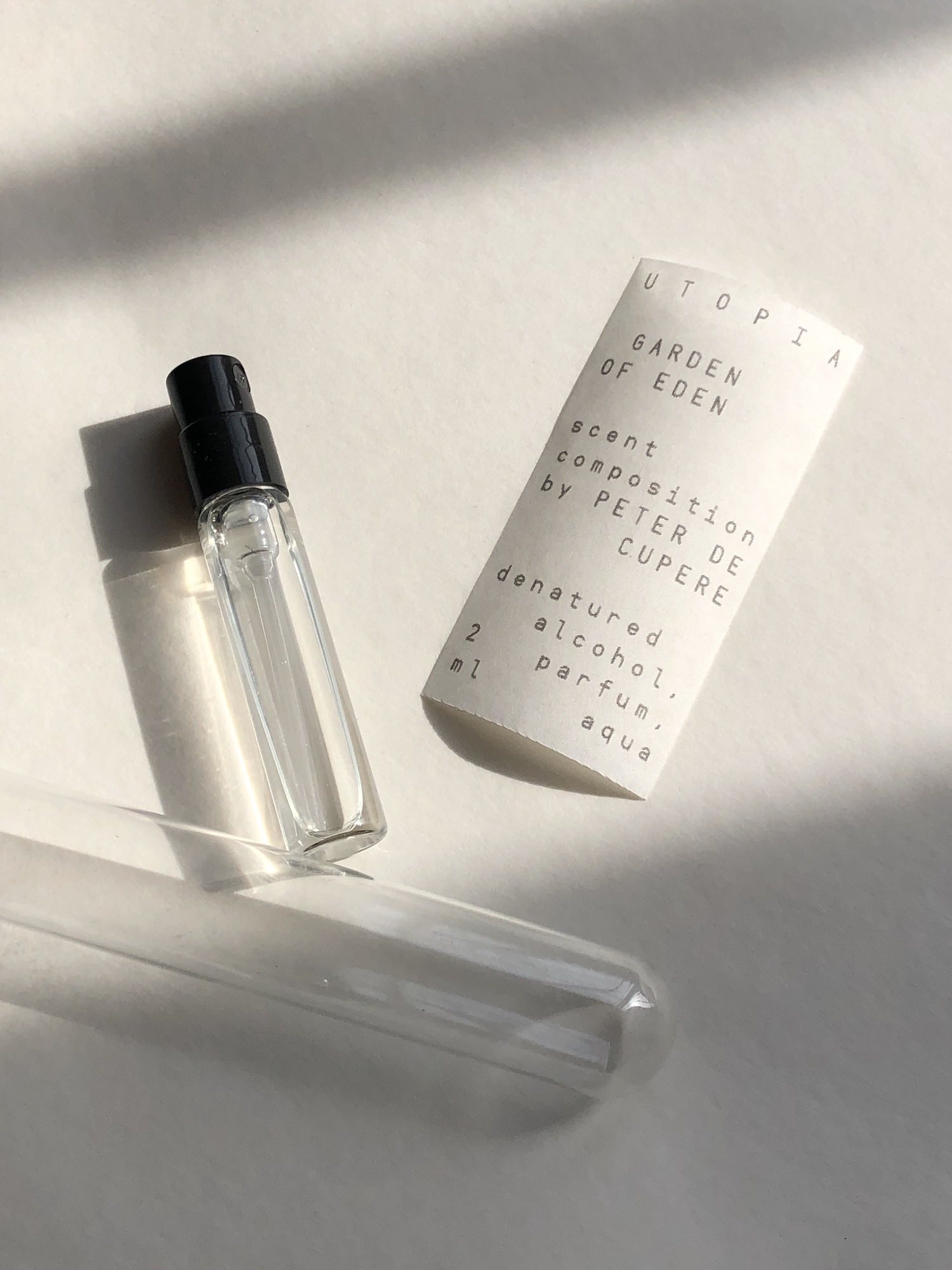
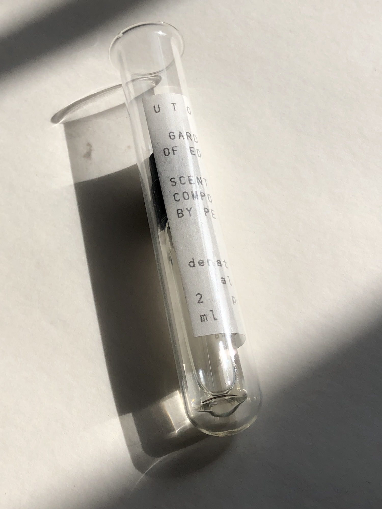
Proposed packaging design for a fragrance by Peter de Cupere to be given away at Lille3000.
Replacing the missing piece
research, information

When I bought my secondhand Braun MP 50 juicer, an iconic work of functionalist design, I didn’t realize that it was missing the plunger. This part is critical for pushing fruit and vegetables against the blade without risking injury. I looked into a paralyzing array of options for replacing this part, evaluating the material outcomes of each and the implications for usability, aesthetics, and collectibility.
Later, I found a variant of the juicer at another secondhand store. What I realized challenged my assumptions about design as problem solving — buying this new juicer and selling the incomplete one was more profitable than any option for replacing or replicating the missing part. Regardless, I modelled and 3D printed a replica part based on eBay photos and my own measurements.

document
2021
Iconic fruit for the consumer
research, hardware


Lemon juice is widely available in small yellow bottles styled with a lemon-like appearance. A wide range of approaches to shape and texture are evident, with different degrees of abstraction. The bottle cap is typically a verdant green. What if these bottles are superseding our idea of what an actual lemon looks like? A green plastic cap that can be stuck onto any lemon resolves this semiotic anxiety, clarifying that what we are looking at is indeed a source of lemon juice. See also ongoing collection of bottles.
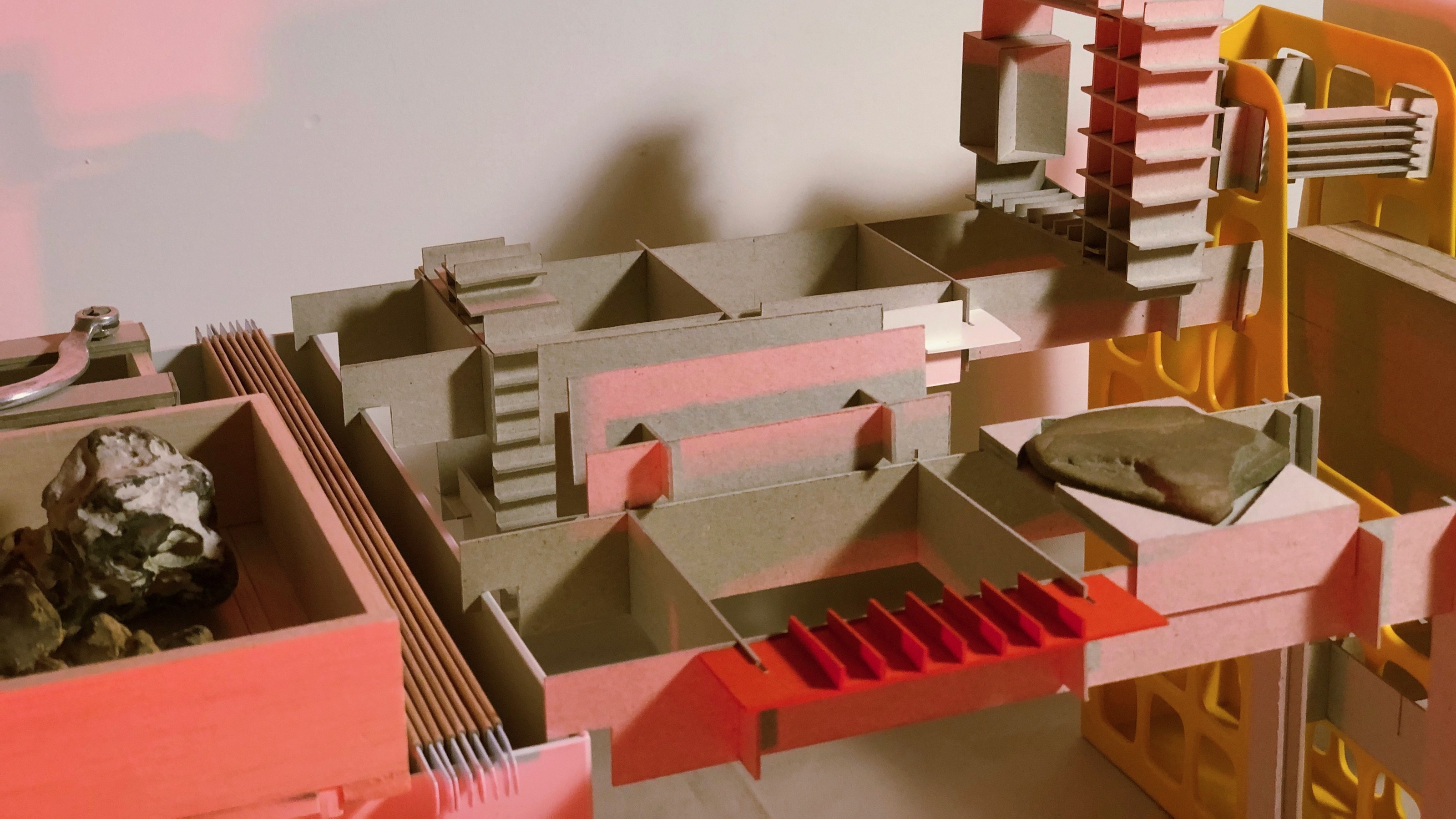
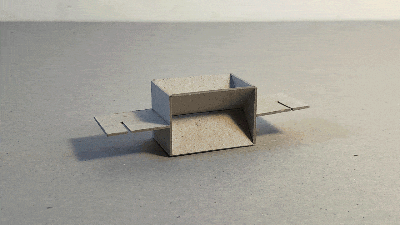
Brutalist abstract
practice

Ongoing assembly and reconfiguration of cardboard scraps into imaginary modernist architectural complexes.
Realistic birds as a service
research
Globule
typeface

Experiment: rational construction of blobby lettering.
Tolerances
graphic, practice

Indulging an obsession with the meaning of measurement verging into numerology: 35mm as a base unit for ideal page composition with ISO formats, and a utopia without margins.
pdf
A discussion about Josef Müller-Brockmann
graphic


Transcript of a conversation about Josef Müller-Brockmann laid out following his grid system method. Three columns (one per person) and cutouts to full-page distorted reproductions of his work and other visuals. Letraset cover. With Louise Dousset and Nathan Raccah.
Anchor escapement
hardware
Collaborative drawing machine
hardware

Tiny room/community garden
graphic, research
Document summarizing findings from studies into two spaces in Eindhoven, one domestic and one communal — a cramped student bedroom and a garden. With Théa Brochard, Lucie Gholam, Michelle Jonker, Brenda Salirrosas López, Luna Wirtz-Ortvald, and Maija Zēģele.
pdf2020
Integrated relational system
hardware
A storage system for symbolic and physical things. Objects entered into the system are classified as missing or represented, or are actually present — with spaces left empty, replicas or representations constructed, or the object itself incorporated.


Shrinkwrap iPod
hardware

Taking advantage of the iPod’s limited feature set to apply an inside-out formal approach to a digital device with analog inputs and outputs, shaping the casing based on its energy and data flows.
more
Emmasingel Kwadrant
architectural

Planning a park for a former industrial plot in the centre of Eindhoven, using the site’s existing geometry to create zones encouraging a range of uses.
moreTrapdoor fest cyber edition
graphic
City/circle
graphic, information
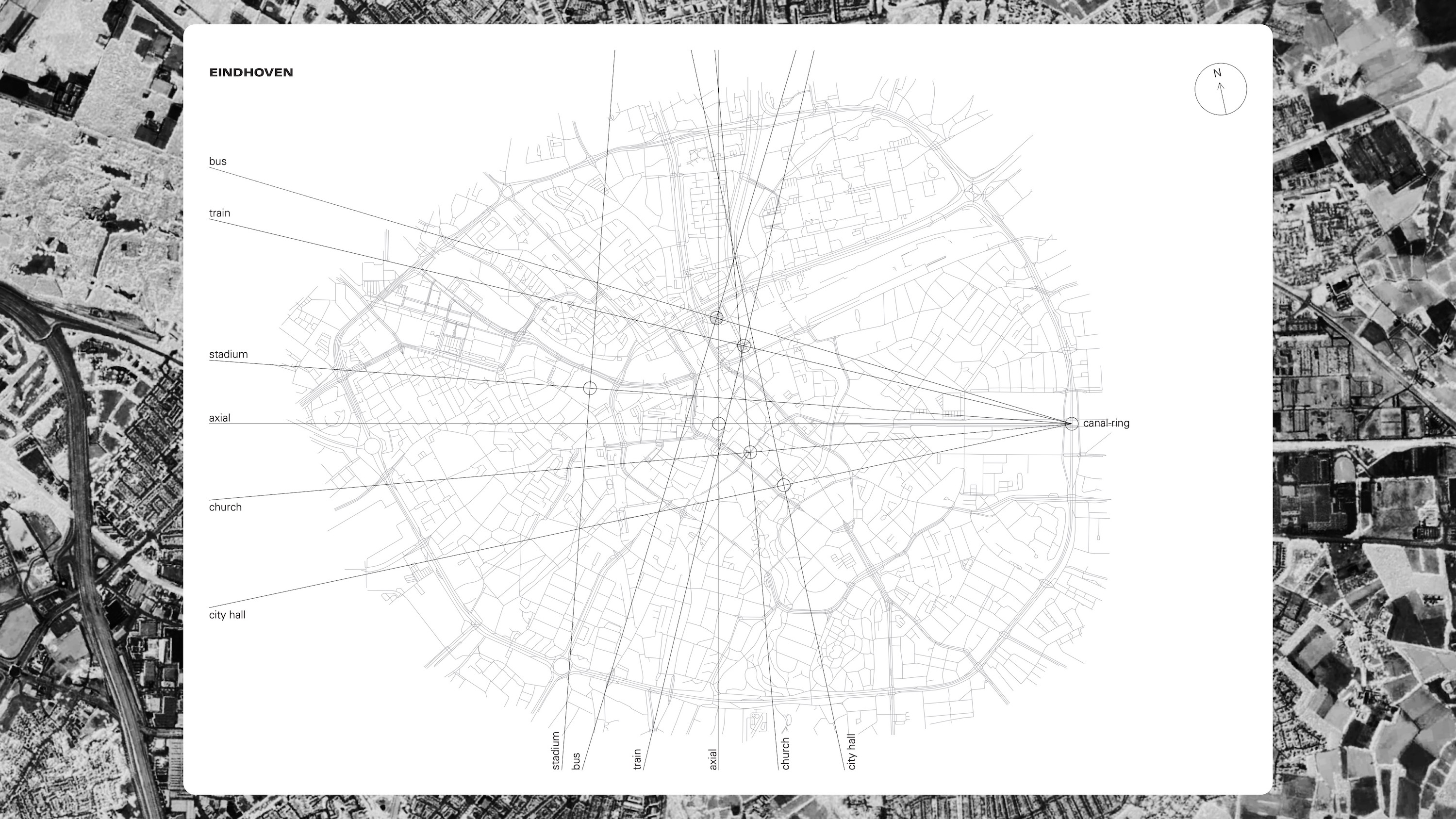
Rather than mapping Eindhoven in the way I might a more familiar city, I responded to the prompt to make a linear map by attempting to more fully translate this place to a flat, narrative representation according to a system of absurd rationality.
I started by travelling around Eindhoven’s ring road by bicycle, looking for a defined entrance to the city. The eastern point where the Ring crosses the canal serves this role.
I identified key sites in Eindhoven that would be immediately recognizable to a newcomer: institutional elements like city hall, national government facilities, and religious congregations; transportation hubs; and a few other cultural centres.
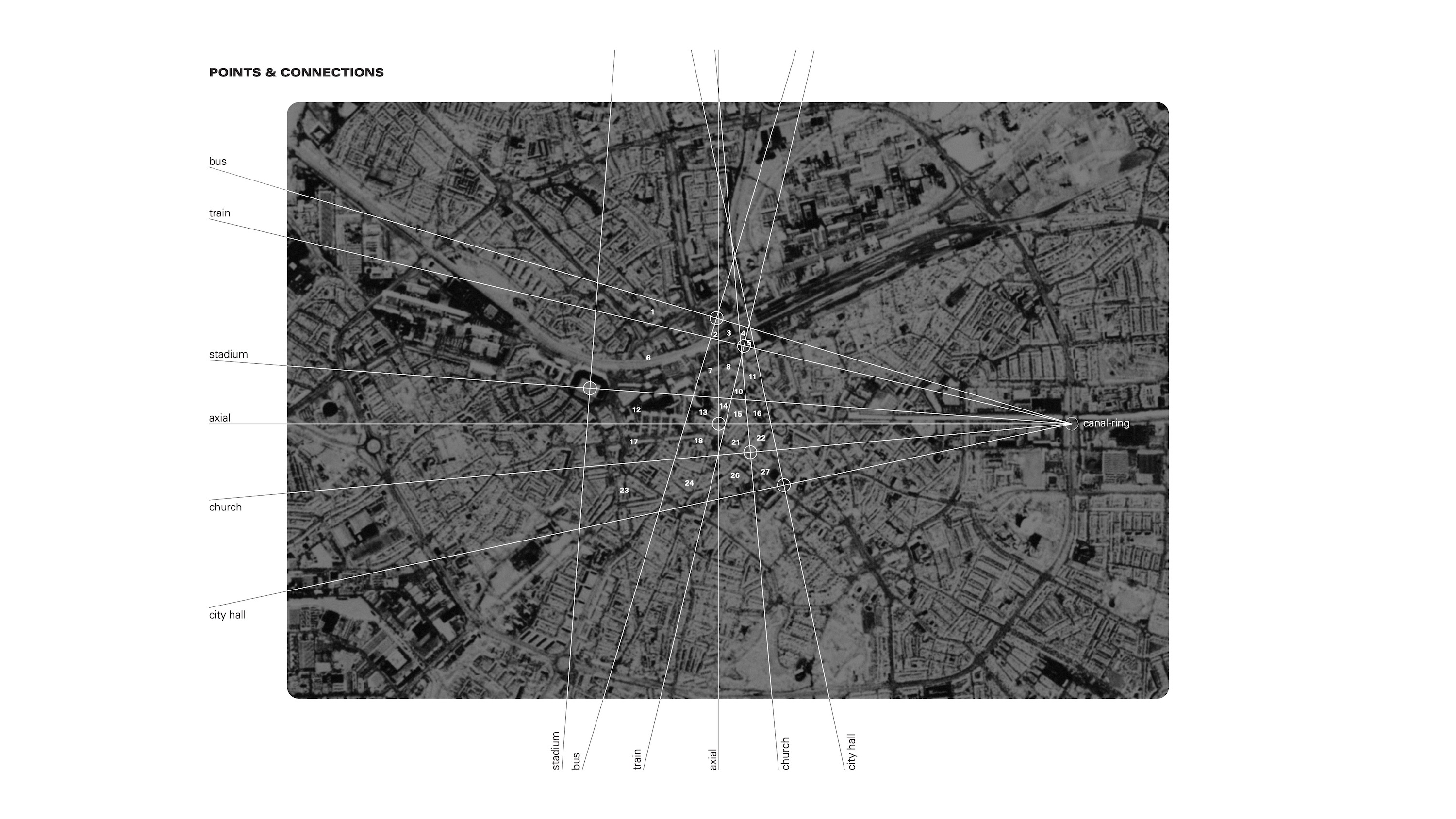
The “entry point” where the canal crosses under the road was the start of radial set of lines that crossed through these key sites to the opposite side of the Ring. Lines perpendicular to these form an intersection on each site, meaning that each site is then associated with three points on the Ring plus the entry point.
The outer lines served as a rough demarcation of the city’s geometric “core”. The remainder of the lines that cross through the core divide it into smaller zones.
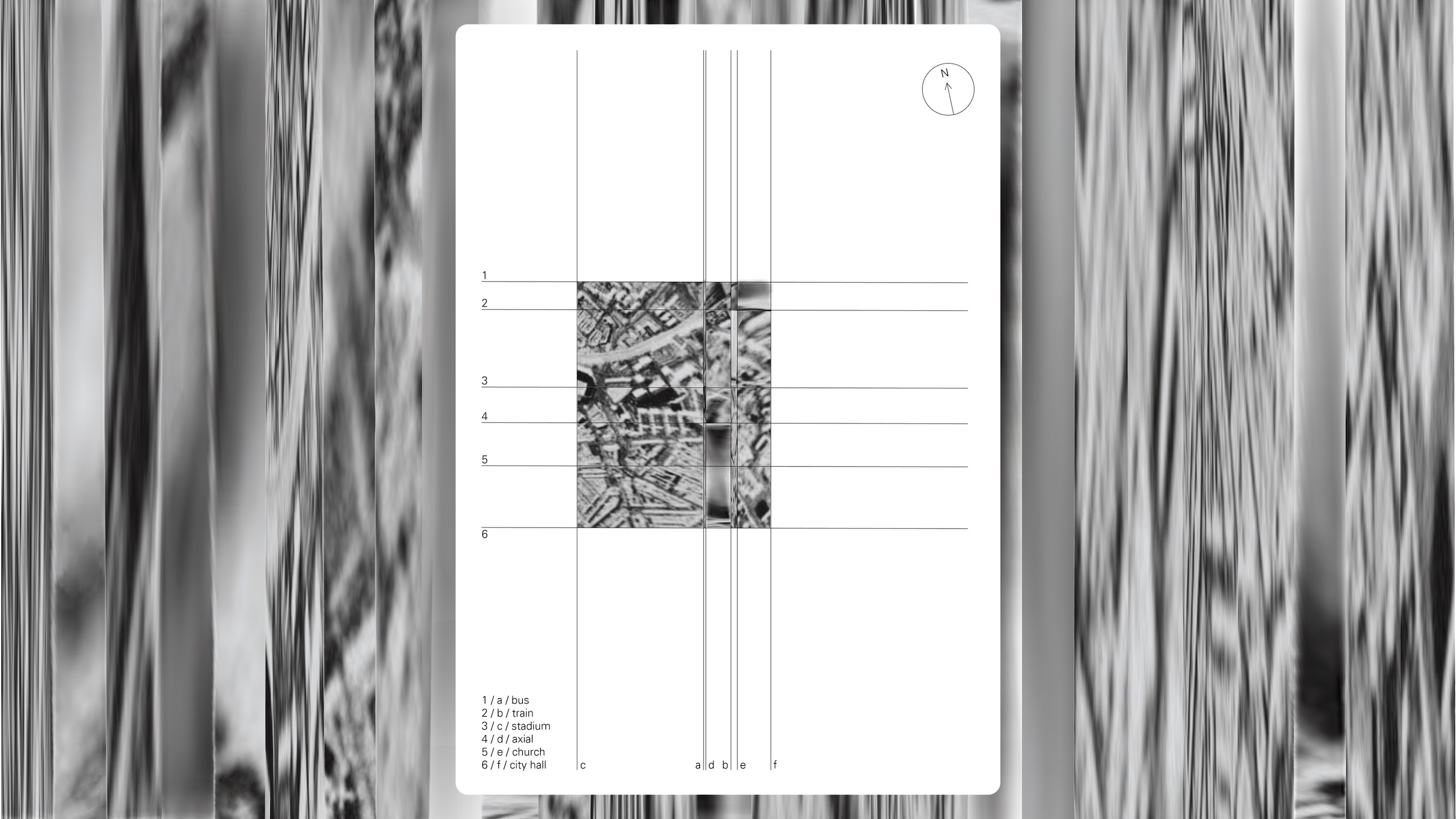
The diagram of lines and zones was then distorted so that the lines run only horizontally and vertically, rather than corresponding to degrees on the rough circle of the Ring, reshaping these zones into rectangles.
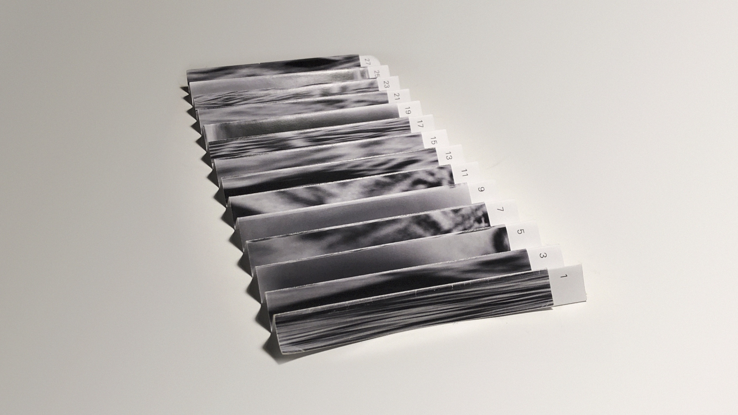
The same distortion and division is applied to a satellite photo of Eindhoven. The satellite image of each distorted rectangular zone is stretched or compressed to all match in size. This series of resized images is presented in an accordion format, labelled with an approximation of the zone’s actual scale (small, medium, large) to determine the degree of distortion.
2019
The site
research
Corner house project
architectural


Factors
information
Interface
research, video
Examining the tactile and sonic interface of two East German cameras at the Deutsches Optisches Museum Jena. Sounds of the camera controls are manipulated and recordings from the vicinity of Goethe’s garden house in Weimar are superimposed.
watch videoPercussion table
hardware
Quanta
typeface
Offline
video
RGB
hardware
Biscotti boxes
graphic, packaging
2018
Acid
typeface

Reversed-stress display lettering.
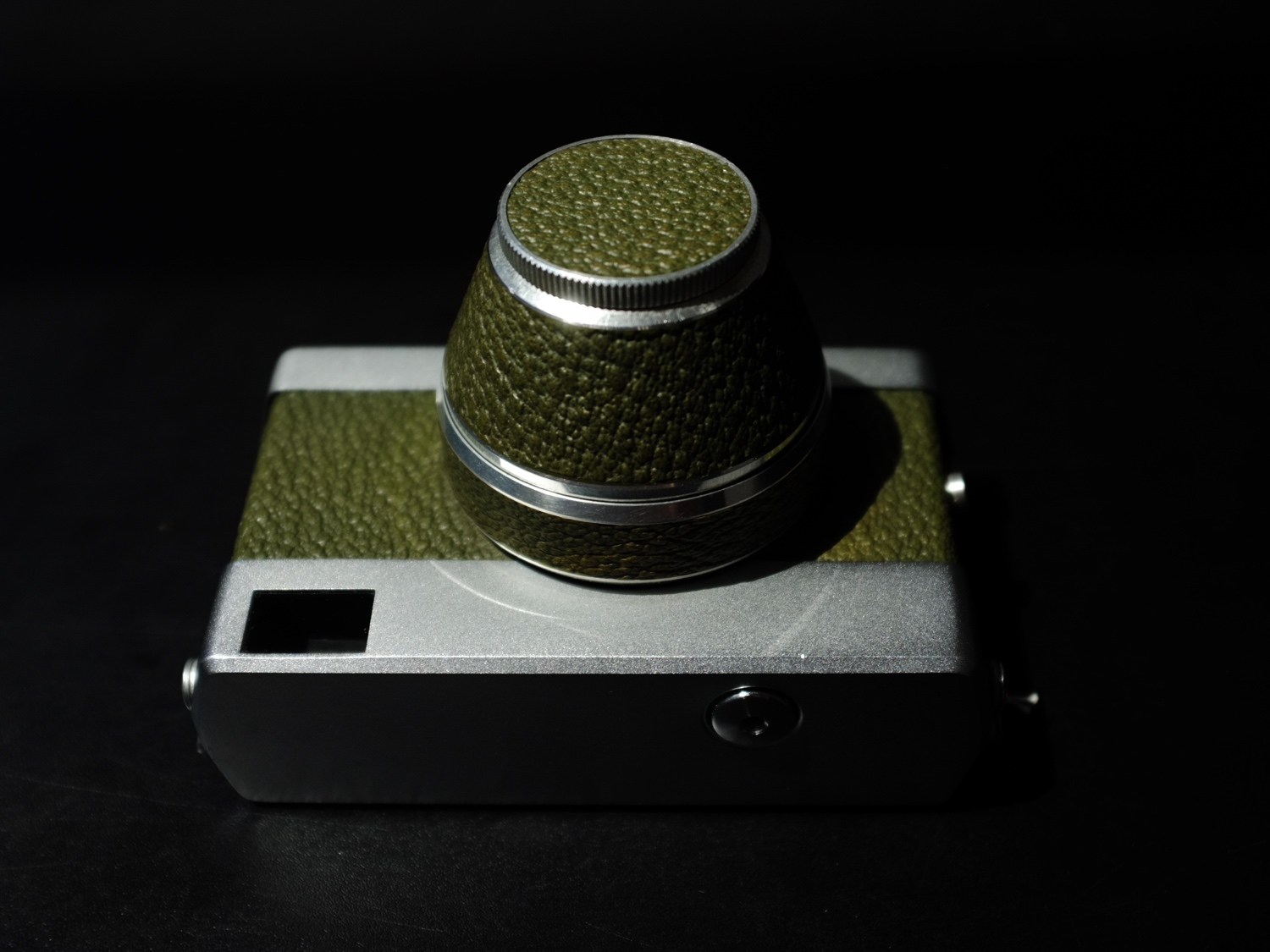
MIDI concept
hardware
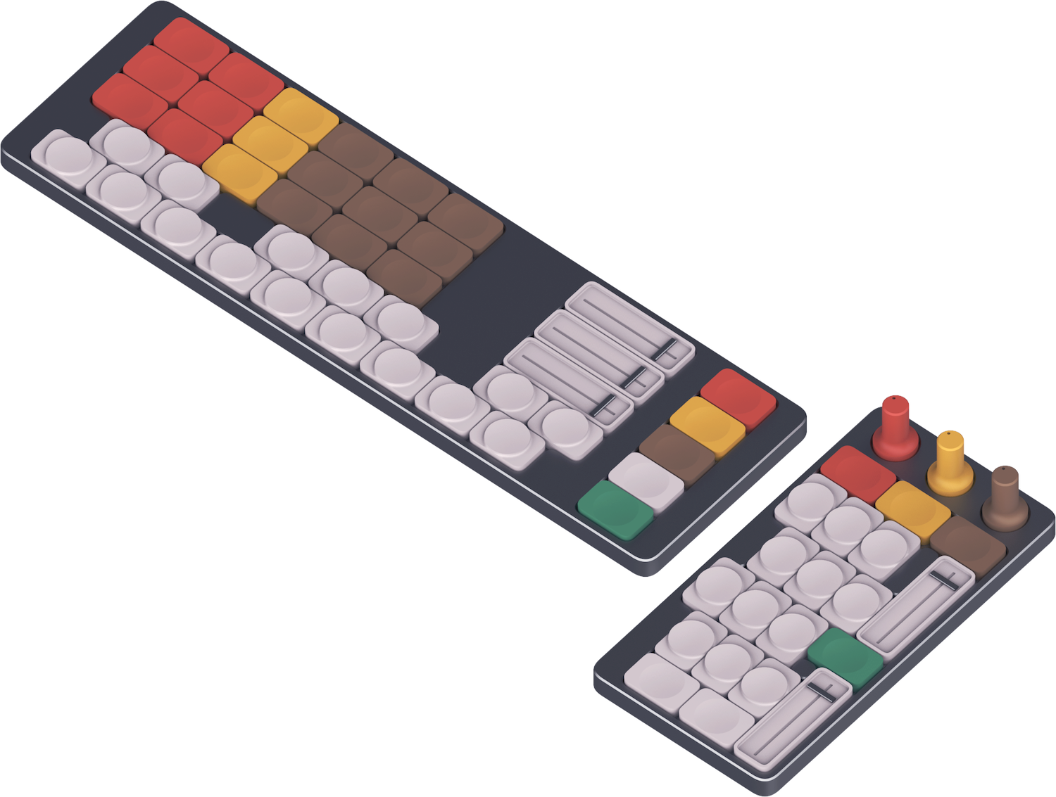
Controllers encouraging freeform button and potentiometer assignment.
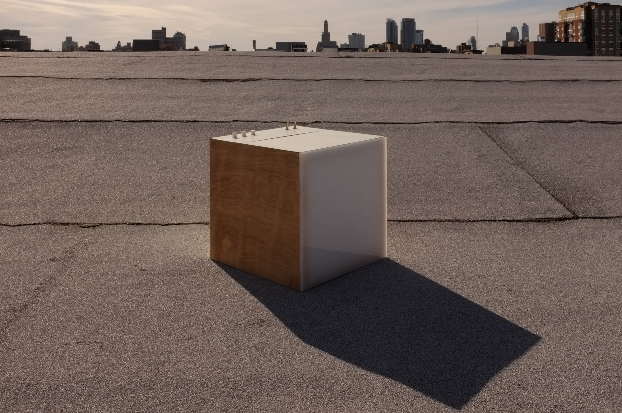
Amplify: the new domestic soundscape
hardware

A small amplifier cabinet (30×30×45cm), solidly constructed of plywood and painted sheet metal with custom 3D-printed knobs. Meant for use at home, it has more furniture- and appliance-like characteristics than comparable portable amplifiers. All controls, inputs, and outputs are readily accessible on the front. The lower compartment, which is easily detachable via low-profile clasps on the sides, can be used to store cables and other accessories and has an integrated power strip. The front panel of the lower section hinges downward and can be used as a surface to attach effects pedals. As naturally as any box, it works well as an ad hoc stool or side table.
2017

Containers
graphic, hardware
Aluminum box
hardware
Contact
hardware
Chess set
hardware

Tea set
hardware
Modulating hand
hardware
Park of culture & rest
video
2016
↑
video
Accretion
painting
Plastic (machine)
installation

A sprawling apparatus that is entirely interconnected but completely nonfunctional and unlinked to external electrical or data systems. Nonsensical junctions like audio cables running into a typewriter betray the solely visual nature of these connections.
ancient history
Seeds
practice

Gathering maple keys, peeling off the leaf fibres, drying the seeds, and collecting them in a plastic box.
about
I’m a designer of graphics, objects, hypertext, and type living in Brussels. I’m also a collector, interested in what we can learn from artefacts of the past, where we find them, and the traces of what they’ve been doing since they were made.
I grew up in the east end of Toronto. After my high school art program, I studied industrial design for a couple of years in New York. I worked in graphic design back in Toronto before spending a semester at the Bauhaus-Universität Weimar, coinciding with the school’s centenary. I started at Design Academy Eindhoven the next fall and graduated in 2023.
I am currently taking on new work — please get in touch!
education
- Design Academy Eindhoven, NL, 2019–23
- Bauhaus-Universität Weimar Produktdesign, DE, 2019
- Pratt Institute industrial design, US, 2016–18
- Etobicoke School of the Arts contemporary art, CA, 2012–16
professional experience
- Independent design practice (see projects, Edith, ObjectsBlog, etc.) Brussels, BE, 2023–
- Identity, graphic, print, & web design Ian Maclaren architect, Oakville, CA, 2016–
- Identity, graphic, web design; book design; fabrication Atelier Lachaert Dhanis, BE, 2022–23
- Graphic, packaging, interaction design (agency) Biography, Toronto, CA, 2018–19, 2021
- Graphic design (in-house) Pratt Institute Creative Services, New York, US, 2017–18
- Workshop staff: fabrication, painting, finishing Moss & Lam, Toronto, CA, 2015
shows, residencies, etc.
- WAW residency, Vaisseau Mère, Brussels, BE, 2025
- DP_CDRA group show, London Design Festival, UK, 2025
- "Front of house" group show, Brussels, BE, 2025
- “In Process” group show, Paimio, FI, 2024
- Fanzines festival, Brussels, 2024, BE
- residency, Paimio Sanatorium Foundation, FI, 2024
- fuorisalone residency, BASE Milano, IT, 2024
- critical workshop, Design Academy Eindhoven, NL, 2023
- Dutch Design Week show, Heuvel Eindhoven, NL, 2023
- Joana Vasconcelos interview, DAMN magazine 82, BE, 2022
- lecture on typography, Design Academy Eindhoven, NL, 2021
- student exhibition, Bauhaus-Universität Weimar, DE, 2019
- group show, Gallery House, Brooklyn, US, 2017
- duo painting show, Project Gallery, Toronto, CA, 2016
- group photography show, Artscape, Toronto, CA, 2016
- lectures on art practice, OCAD, Toronto, CA, 2015 & 2016
- group show, York University, Toronto, CA, 2015
links
writing
special projects